PREVIOUS EXHIBITIONS:
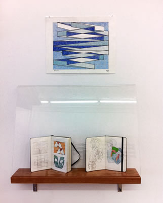
Ward Schumaker : Demi-urge
December 9, 2016 – January 22, 2017
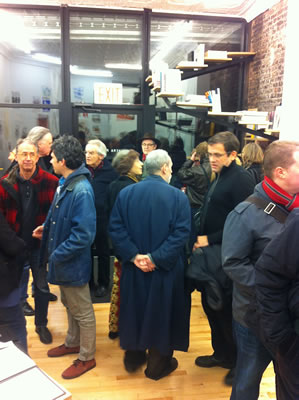
Opening reception Dec 9th 6-9
Artist Talk and Page Turning Event
Saturday Dec 17th at 3pm
PRESS RELEASE:
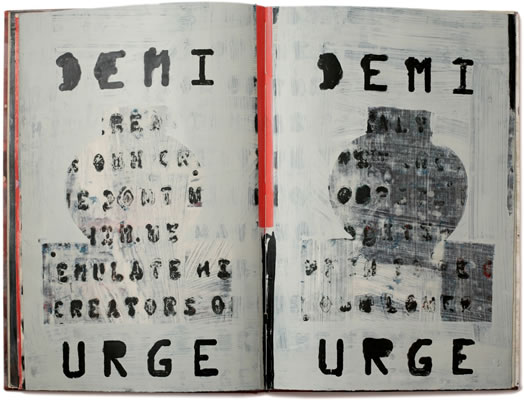
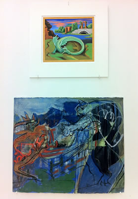
DEMI-URGE
Books & Works on Paper by Ward Schumaker
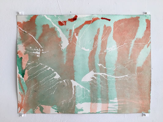
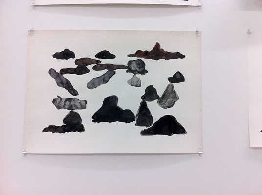
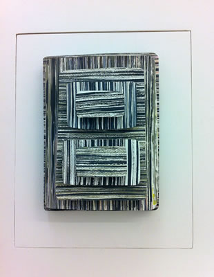
Schema Projects presents works on paper and handmade, hand painted books by San Francisco artist and illustrator Ward Schumaker. With a painter’s hand and a love for the printed word, with stroke, by mark, or letter by letter, Schumaker’s seduction begins. Paint, paper and page have been his dedicated sphere since art school when he resisted his Professors urge to abandon the use of text in his work. He cited early religious manuscripts as an example of important art that integrated narrative image and text and moved forward in his task. The result of this overlap is a richly evocative world, like a mouth that does not speak but that in someway we feel and read as these “opposites” mix in his painted works. His oeuvre seeks a peaceful reunion of left and right sides of the brain and the viewer is richly rewarded.
In his fine art practice, as opposed to his award winning and prolific illustration practice, there is a sense of lost and found and a willingness to risk everything. Schumaker invents an awake dreamworld filled with a fog without figure. The painted surfaces, washy-brushy, seem at once Asian influenced, Ab-Ex in form, yet also accidental. The feeling is of a private space, where fragments of a sound, a word or a scrap of paper exist together in muted and elegant harmony. While decorative effects are used they are rich and satisfying, where repeated pattern unfolds, there is ample variety. The use of imperfect stenciled letters transports us back in time. A text used as inspiration, exudes a perfume distilled from it. Finish is cultivated. Each painting on paper acknowledges a century of American abstraction yet is a bit of an outlier. The milky feel of layering is due to the unconventional inclusion of book paste binder, which Schumaker incorporates into his paint. Perhaps also, the emotive and dream-like quality of this work is a result of the daily mediation practice that Schumaker continues to follow.
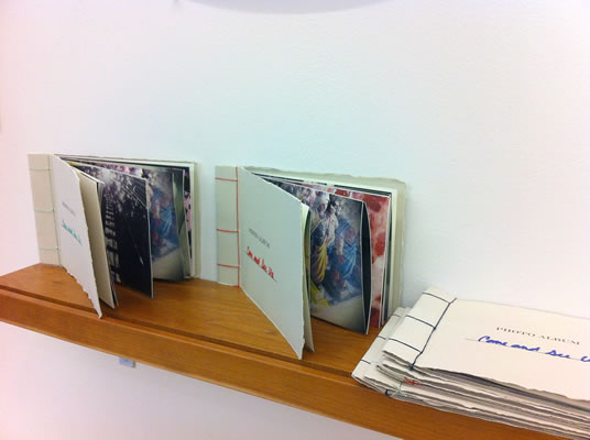
The books works astonish. They began with a workshop he took with his wife, the noted American Illustrator Vivienne Flesher, at the San Francisco Center for the Book. It was here, that his fine art career was born when a gallery dealer from Shanghai saw book covers hanging on the wall to dry and proposed a painting show. Page after page gives us much more than expected and builds in monumentality. We are thrust into the big classic past yet the immediacy of the painted surfaces holds us in the grip of the now moment. His work feels deeply connected with the artistic tradition of San Francisco, Beat poetry, the spoken word, shifting weather patterns.
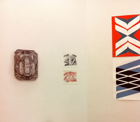
Ward talks about the books included in our show here: "In the early 50's, many of us were involved in huge paper collection--to raise money for schools, for example. One year, deep within the tons of books, newspapers, cardboard boxes, I discovered a couple huge wallpaper sample books. I got drunk on the visuals. Later, an older brother introduced me to the output of small, private presses (ex: The Roycrofters) and I collected these out-of-fashion tomes at ten cents each. The bindings, the letter-pressed pages, the flamboyant wallpaper repeats: when I started painting seriously again, after a hiatus of around 35 years, I returned to those memories. Creating books gave me a place to relearn handling a brush, to try new ideas/styles, and to keep it in a form that progressed from front-to-back in a way that seemed to make sense to me. Some books are done for the simple reason of creating beauty (ex: Grid Stop), some to record the results of meditation (ex: Being Everyone), and some as an homage to artists I admire (ex: Throat Singing in Drohobycz, which is an homage to writer Bruno Schulz). I think of the books as very different from my paintings and it's rare that I would find a page to be the correct thing to hang on a wall; it's the turn-of-pages that makes it work. Most of all, I simply have to do it. So I do."
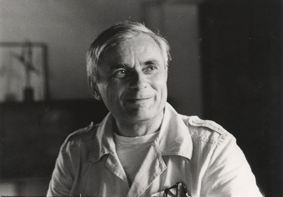
Ward Schumaker is an award winning designer and illustrator whose fine art work is regularly shown in New York, Los Angeles, San Francisco, and Shanghai. Schumaker’s design and illustration work has been featured in The Washington Post, the San Francisco Chronicle, and The New York Times and for The Yolla Bolly Press, Hermès, Paris, and Deutsche Grammophon. He is the author of three children’s books (Harcourt Brace and Chronicle Books), and has worked primarily as an illustrator—for The New York Times, The New Yorker, The Washington Post, and others. He has also worked on book covers for major publishers/imprints, including Random House, Knopf, and Simon & Schuster. San Francisco Chronicle art critic Kenneth Baker named Ward’s 2013 show at Jack Fisher Gallery one of the ten best exhibitions in San Francisco that year.
Denise Stewart-Sanabria wrote: "Ward Schumaker has been interpreting text into visual narrative for most of his working life. Though he started out in fine art over 40 years ago, he evolved into an internationally recognized illustrator for most of his career and is still heavily involved in the business. His illustrational style uses text as an integral part of the drawing to identify his clients and their products. Eleven years ago, he journeyed back into his mind to create for himself."
Ward will talk about his work and "turn some pages" in his books, on Saturday Dec 17th at 3pm.
» download press release
The installation will remain on view every weekend Saturdays and Sundays from 1-6pm or by appointment. Please contact the gallery for further information or a checklist. info@schemaprojects.com
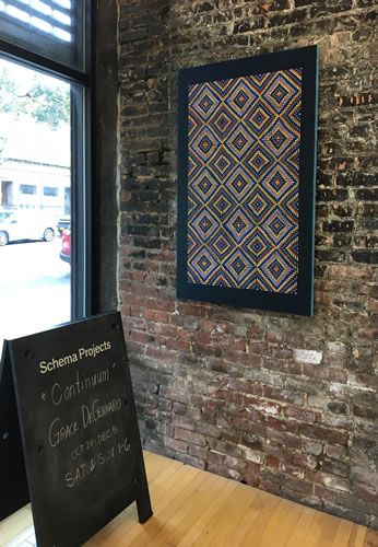
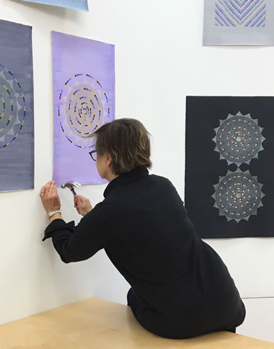
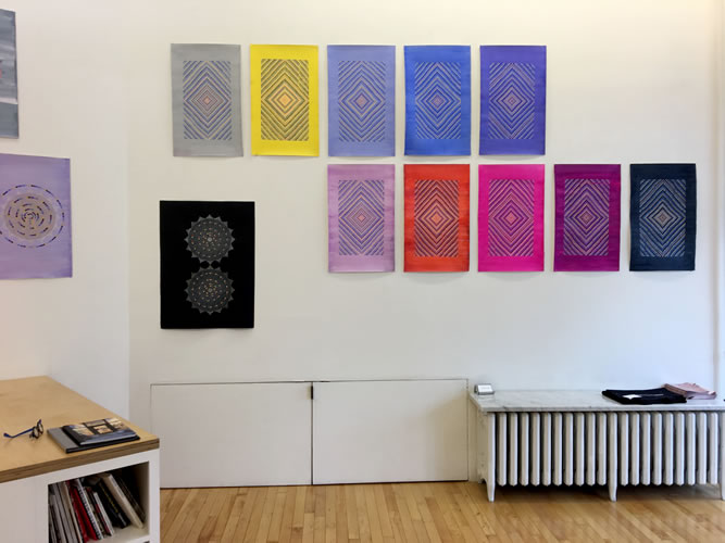
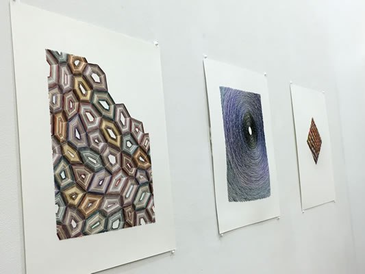
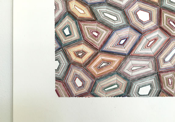
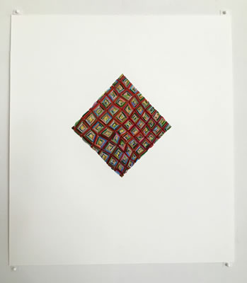
Continuum
Works on paper by Grace DeGennaro
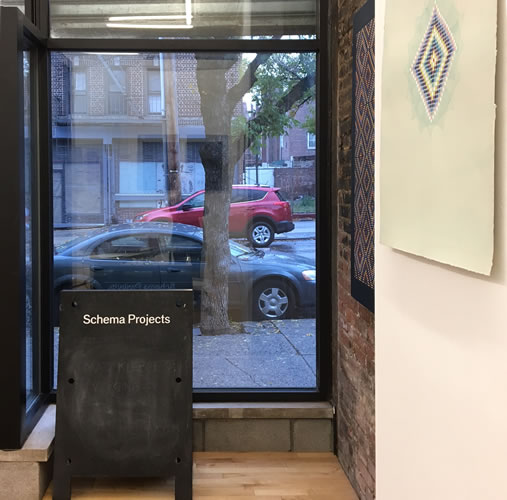


PRESS RELEASE:
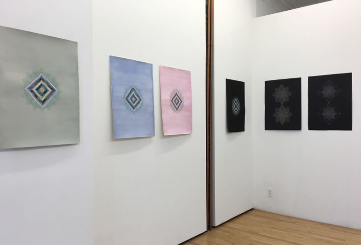
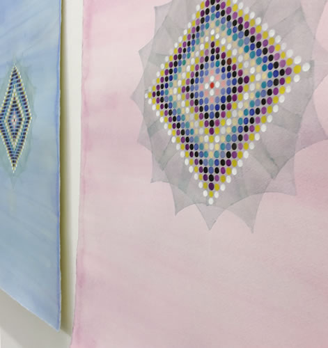
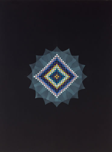
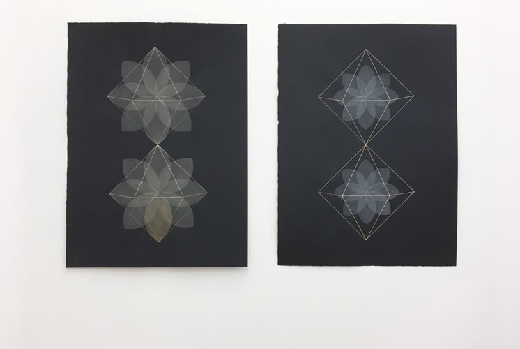
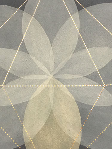
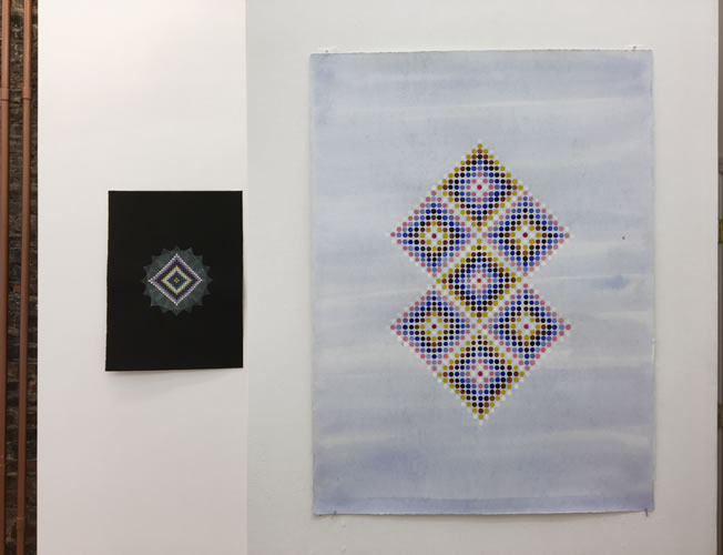
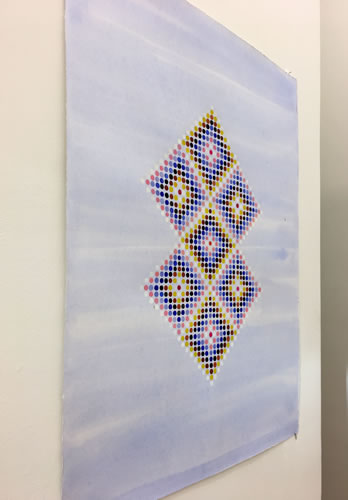
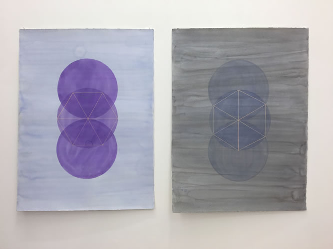
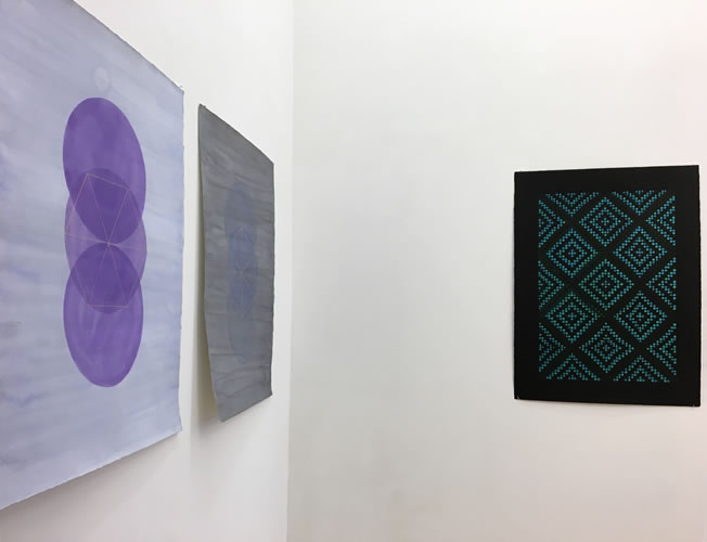
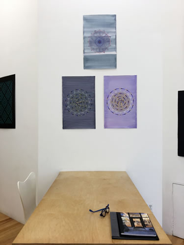
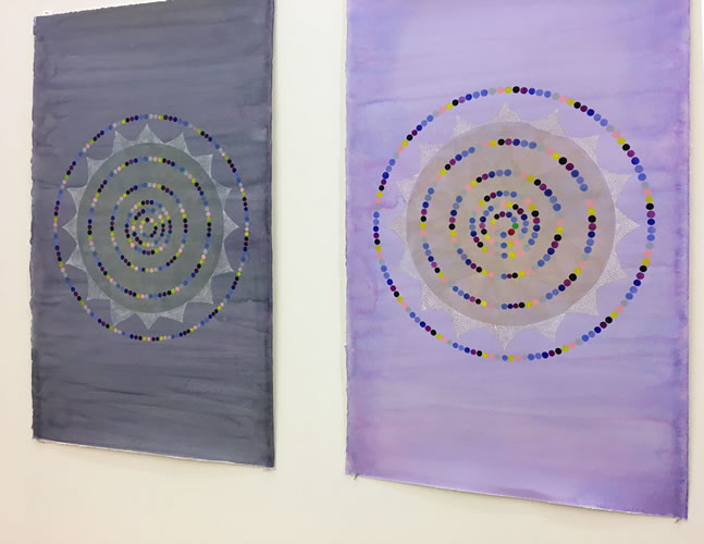
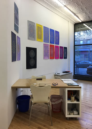
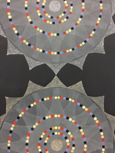
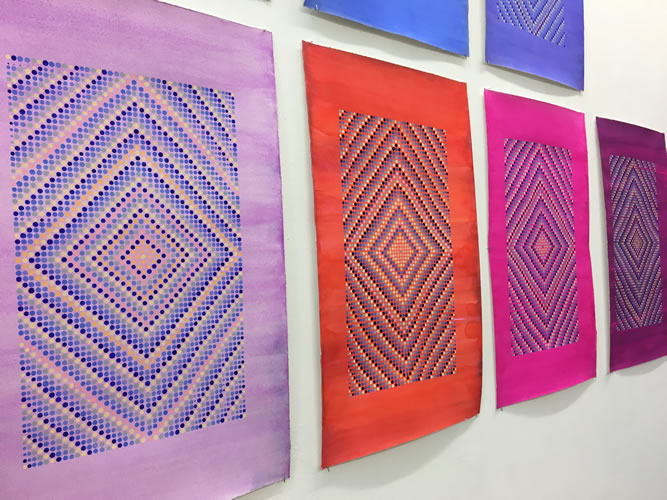
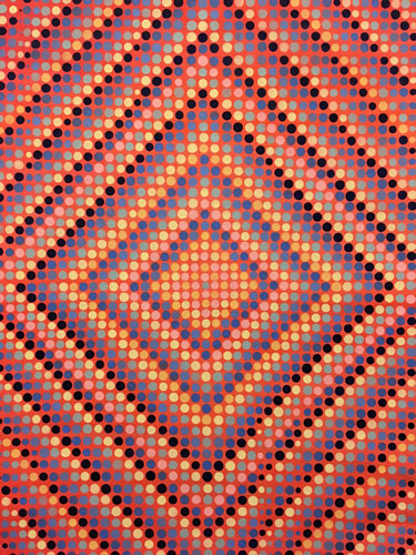
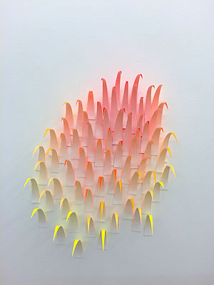
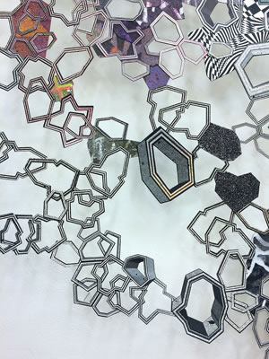
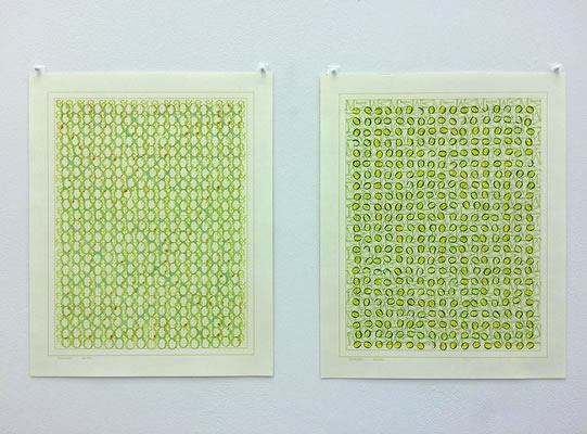
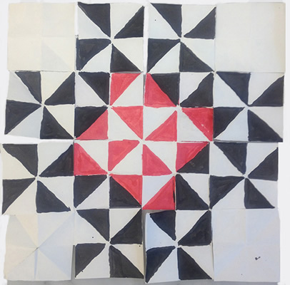
In her current painting series Continuum, artist Grace DeGennaro strives to convey to the viewer a sense of the unseen structures that supports the universe. Each of the paintings on paper featured in her show at Schema Projects, begins from a central axis that divides the support into equal “golden” sections. Starting at the center of a schematic framework, DeGennaro applies small beads of pigment in a process that combines colors in recurring accretions. The resulting lattice of color on a contrasting ground imparts a gnomonic expansion, much like the symmetric growth of a tree, a shaft of wheat, or the shell of a nautilus. Each mark begets and relates to another mark, creating a visible record of time as the surface evolves and the past is seen with the present.
While DeGennaro builds on the language of geometric abstraction, her innovation is to create works of a potent energy force, at turns vibrational or calming. We feel a rapture that is like star gazing which holds us within its thrall and the organized progression from work to work unfolds in an orderly fashion filling us with visual delight.
» download press release
The installation will remain on view every weekend Saturdays and Sundays from 1-6pm or by appointment. Please contact the gallery for further information or a checklist. info@schemaprojects.com
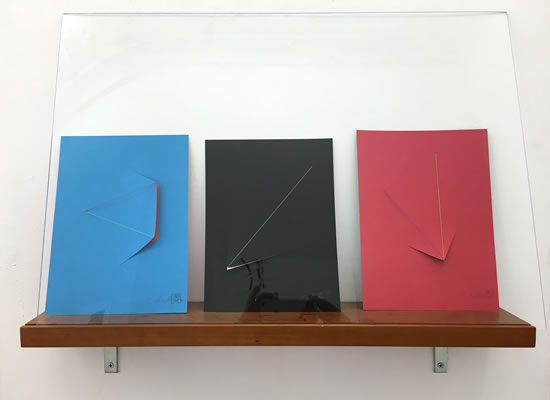
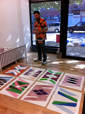
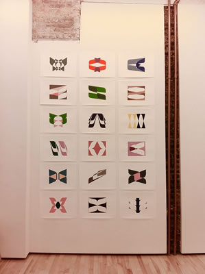
Matt Kleberg : Verging On
Works on paper large and small
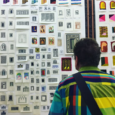
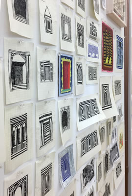
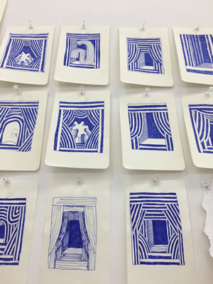
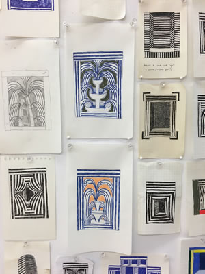
PRESS RELEASE:
There are a million pathways and a million doors. In the parallel world, an infinity. With the exhibition Verging On, Matt Kleberg fills the gallery with a hundred doors, mini stages, heavy curtains, bristling thresholds, pieces of a place one never enters into. The work, ripped from sketchbooks, on small scraps of gridded paper or on random board, will fill the gallery in a kind of surrogate studio.
In Kleberg’s world, these curtains, lintels, niches, stages and door frames, are depicted in lush and harmonious colors or are mapped out in sharp contrasts of black and white. This is a world where the sun is the illuminator and it is a hot and brilliant light. The blocks of shadow shapes ground the viewer and put them in that place. Standing in the center, turning, one can spy, like an occasional fluffy cloud floating through a brilliant blue desert day, fountains that might be hills, twisting shapes that might be plants or a solitary figure in an otherwise built landscape. Jagged patterns abound, suggesting lightening or electricity or military architecture. Solid walls of strongly striped color, bend and block our passage. Maybe they are “verging on” coalescing into a grand memory palace, or about to unfold into a play. This strong sense of place, where the inhabitants are hidden, creates a mystery that is at the heart of the appeal of Matt Kleberg’s work.
Matt Kleberg (b.1985, Kingsville TX) received his BA from the University of Virginia in 2008 and his MFA from the Pratt Institute in 2015. Recent exhibitions include Pierogi’s Boiler Room (NY); Honey Ramka (NY); Mulherin New York (NY); Schema Projects (NY); Welcome Gallery (VA); David Lusk (TN);Morgan Lehman (NY); and Hiram Butler (TX). His work has been written up in the New York Times, The Brooklyn Rail, WNYC, Painting is Dead, Artsy, Vice, ArtDaily, and New American Paintings. His work is included in public and private collections including the Museum of Fine Arts Houston and the Williams College Museum of Art. Kleberg lives and works in Brooklyn, NY.
» download press release
PPP: Painters Painting on Paper
Harriet Bellows, Mark Joshua Epstein, Yifat Gat, Mara Held, Jenny Hankwitz, Julian Jackson, Matt Kleberg, Paul Pagk, Terri Rolland, Andra Samelson, Melissa Staiger, Jeanne Tremel
A group show of works on paper by abstract painters
May 27 - June 18, 2016
Italian Airs
Carrie Beckmann, Christophe Boulanger, Richard Kooyman, Melanie Parke
A Pop up show of works inspired by Italian sojourns
May 19 - 24, 2016
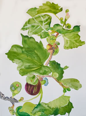 Carrie Beckmann, "Figs"
bedfordandbowery.com/tag/bushwick/
PRESS RELEASE:
Italian Airs is a Pop Up show at Schema Projects which includes the work of Carrie Beckmann and Christophe Boulanger (made at the BAU Institute in Otranto), Melanie Parke and Richard Kooyman,
(made in Rome at the American Academy).
As artists we are citizens of the world. Culture unites us and we absorb all that is local and new to us, each seeing with her own eyes; in fact, we go for that, a chance that something new will enter our work through the cracks. In this case, Italy, that great jutting peninsula on the Mediterranean, home to the earliest of cultures and thereafter, overrun by many of the great cultures of the world, each adding their tint to the ferment. Some of us just sit on a hill and absorb the beauty of the cultivated landscape, an olive tree, a cypress lined road, the rows of vines, some roses. Others marvel at the stacked stone walls, menhir in the fields, the blocks of Etruscan stone, rutted Roman roads, the mosaics of Byzantium, the Romanesque churches, castles and towers. Some of us perch ourselves over the bodies of clear blue seas or high mountain peaks filled with colorful wildflowers. And some of use go to encounter our favorite works of art, panel paintings, fresco cycles, masterworks of painting in dark churches, great sculpture in public piazzas. And we therefore encounter a lost part of ourselves: perhaps it was in the air. The Italian Airs.
SATURDAY TALKS
Richard Kooyman will give a slide talk on "Concepts of Beauty-‐Ancient and Modern" (30minutes) research created during his Italian residencies that thread together contiguous concepts of beauty that radiate from ancient times into contemporary pulses that affect his work.
Melanie Parke will give a talk entitled "Sapphic Diaspora" (20 mintues) the title of her series of gouache paintings that evolved during her time as a Visiting Artist at the American Academy in Rome. The Sapphic Diaspora is a feminist inquiry that seeks to juxtapose imagery of ancient women, and most often the lack of them, with a climate and cultural consciousness in feminism in which exile, dispersal, and uncertainty of belonging continues to weigh down on the female body.
ARTISTS STATEMENTS
Melanie Parke:
"What if Sappho" is a feminist inquiry realized through a series of figurative imagery in gouache on paper. Reassembling an envisioned legacy in which Sappho's poetry actually survived and thrived, I am riffing on motifs typically reserved for men by succeeding them with women. These drawings repurpose existing representations of women and most often the lack of them, from mosaics, frescos and sculpture in the ancient world. This project materialized during my time at the American Academy in Rome as a Visiting Artist, November 2015.
Richard Kooyman:
Through painting I explore what remains beautiful from the ancient Roman past.
The walls of the Domus Aurea or Augustus’s Ara Pacis look nothing like they did in their day yet a beauty moves from these works forward through time. What ideals and concepts of beauty still radiate from these works of sculpture and paintings? Not only the style but the idea of beauty itself has evolved over years and begs the question-‐ What aspect of these ancient aesthetics have endured?
By making paintings of Roman figures and the domestic landscape I’m attempting a type of visual archeology. I’m searching for classical ideas and forms of beauty which I am able to re-‐contextualized into my work.
Carrie Beckmann:
I work out of doors, whenever possible. I sit on the ground. I work on a flat sheet of paper, applying watercolors, with high pigment content using a brush. I tune into wherever I am, absorbed by the light and the landscape, and the sounds, smells, vegetation, people, animals, cuisine, of a place. I am an observer and an absorber and a wanderer and a traveller. My paintings are as much about the act of painting and paint as a material as they are about place. When I’m before that tree, I am intuitively exploring how it might be painted. Working outside I am also open to comments people make to me while I work. They say so much about what part of the world I am in be it Mumbai, Otranto, or Brooklyn.
Cristophe Boulanger:
In the south of Italy, at the tip of the boot, in Apulia -‐ stones, land and hot weather -‐ the age-‐old olive trees resist. On the side of the road stand the most beautiful ones, crumbling, twisted, hooked on life. They have seen everything, experienced everything, they are the ancestors. One no longer knows if these unique visages are vegetable or mineral.
I have chosen to uproot them, during the time of a residence in Otranto, to make them dance to the rhythm of the Taranta -‐ local healing ritual -‐ mixing music, trance, and devotion. I wanted to put the pieces back together, to repair, to patch, to graft them a heart, a pump of colors. They are "les tord boyaux", well-‐spirits.
Tout au sud de l'Italie, à la pointe de la botte, dans les pouilles -‐ terres de cailloux et de canicule -‐ résistent les oliviers séculaires. Au bord des routes se dressent les plus beaux, les croulants, les tordus,
accrochés à la vie. Ils ont tout vu, tout vécu, ce sont les ancêtres. Chacun à une trogne unique dont on ne sait plus si elle tient du géologique ou du végétal. J’ai choisi de les déraciner, le temps d’une résidence d’été à Otrante, de les faire danser au rythme de la tarentelle -‐ rituel de guérison local -‐ mêlant musique, transe, et dévotion. J’ai eu envie de rassembler les morceaux, de réparer, de rafistoler, de leur greffer un coeur, une pompe à couleurs. Se sont les «tord boyaux.
» view press release
Tower of Babel
A large international group show relating to the theme of language as a barrier to communication. The exhibition will travel to Tel Aviv, Israel and Perugia, Italy.
Co curated by Doron Polak, Givatayim City Gallery Tel Aviv, Israel & Trebisonda Centro per l'Arte Contemporanea Perugia, Italy
April 14 - May 15, 2016
PRESS RELEASE:
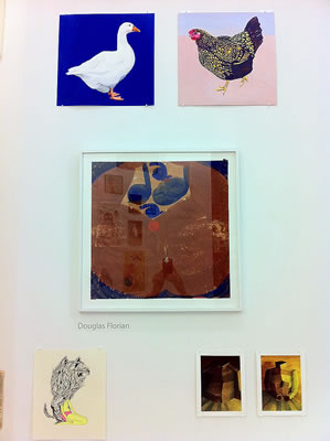
Organized by Schema Projects gallery, our theme is the “Tower of Babel”: language, it’s varieties and limits, how it aids us and hinders us, how it hides and glorifies, the division of a people by a greater power (the old testament Judeo-Christian god) by impeding their ability to communicate and by extension, disinformation as a strategy of control and punishment. All participating artists were asked to create a new work that addressed these ideas.
The story of the Tower of Babel from Genesis could be seen as an explanation for the origin of languages. According to the story, a united humanity of the generations following the Great Flood, speaking a single language, migrated from the east and came to the land of Shinar. As the King James Version of the Bible puts it, this happened next:
“…And they said, “Come, let us build ourselves a city, and a tower whose top is in the heavens; let us make a name for ourselves, lest we be scattered abroad over the face of the whole earth.”
But the Lord came down to see the city and the tower which the sons of men had built and he said:
“Come, let us go down and there confuse their language, that they may not understand one another’s speech.” So the Lord scattered them abroad from there over the face of all the earth, and they ceased building the city. Therefore its name is called Babel, because there the Lord confused the language of all the earth; and from there the Lord scattered them abroad over the face of all the earth. “
—Genesis 11:4–9[1]
Participating artists:
Invited by Schema Projects:
Rosaire Appel, Dmitry Babenko, Bunny Burson, Kevin B Chen, Paul D’Agostino, Steve DeGroodt, Julie Evans, Edoardo de Falchi, Abdellah El Haitout, Scott Espeseth, Douglas Florian, Simona Frillici, Rico Gatson, Andrew Ginzel, Johannah Herr, Jeanne Heifetz, Meg Hitchcock, Sharon Horvath, Sam Jablon, Mary Judge, Susan Kammerer, Marthe Keller, Elisa Macellari, Arezoo Moseni, Morgan O’Hara, David Pearce, Madeline Schwartzman, Buzz Spector, Gwenn Thomas, Selin Sinan Uz, Moe Yoshida Vegetti, Allan Wexler
Invited by Doron Polak, Givitayem City Gallery, Tel Aviv Israel:
Manel Alvarez, Sima Ariam, Roni Ben Ari, Ophira Avisar, Yael Balaban, Elizabeth Baniel, Liad Baniel
Edna Elstein, Baruch Elron, Etamar Beglikter, Shlomo Bronstein, Yaacov Chefetz, Shirly Perla Doron, Norma Drimmer, Uri De Beer, Varda Carmeli, Amiran Eini, Amir Eshel, Regina Frank, Bilha Fuchs, Gideon Gechtman, Bela Gold, Eugenia Gortchakova, Tamar Hirschl, Irit Segal Israeli, Shlomo Korol, Erika Knerr, Zvia Merdinger, Dafna Moriya, Noa Nahari, Shalom Neuman, Inna Nikolaeva, Rakefet Viner Omer, Ruty Weinstein Paporisch, Doron Polak, Meir Rakocz, Ariel Resendiz, Dorit Saphir,
Zoe Sever, Danny Shain, Dan Shavit, Koby Sibony, Avi Sperber, Suzy Sureck, Amir Tomashov, Ari Varda,
David Wakstein, David Zondelovich, Ilana Yaron
Invited by Trebisonda Centro per l’arte Contemporanea, Perugia Italy:
Paolo Assenza, Stefano Bonacci, Arianna Bonamore, Polly Brooks, Sauro Cardinali, Tonina Cecchetti, Mario Consiglio, Luca Costantini, Massimo Diosono, Danilo Fiorucci, Benedetta Galli, Tea Giobbio, Elfrida Gubbini, Piotr Hanzelewicz Karpuseeler, Robert Lang, Serenella Lupparelli, Francesca Manfredi, Vittoria Mazzoni, Roberta Meccoli, Laura Patacchia, Ugo Piccioni, Attilo Quintili, Lucilla Ragni, Nicola Rotiroti, Virginia Ryan, Sandford & Gosti, Germano Serafini, Stefano Soddu, Meri Tancredi, Franco Troiani, Walter Vallin
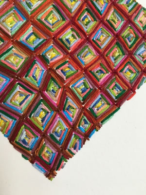
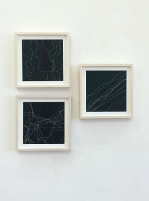
Passing Through
Group show of artists who use thread, whether as dimensional line, to embody time, or to map the world's hidden forces.
Chris Arabadjis, Takeshi Arita, Emily Barletta, Emily Hass, Daniel G. Hill, Lorrie Fredette, Robert Lansden, Oriane Stender, Audrey Stone, August Ventimiglia, Susan Walsh, Tenesh Webber
Inaugurating the Schema Projects Sculpture Space: Barbara Campisi
curated by Jeanne Heifetz
March 4 – April 10, 2016
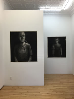
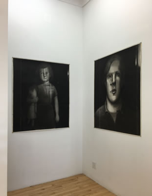
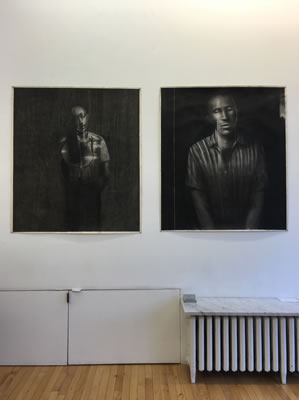
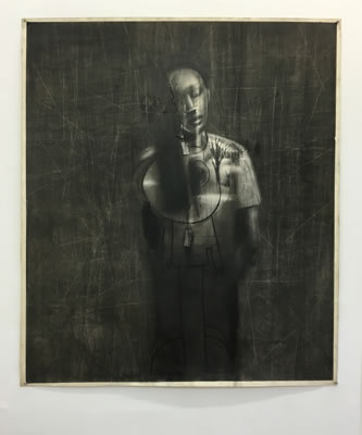
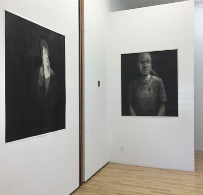
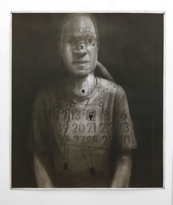
Fred Valentine: The Pumpkin Festival and other Portraits
January 22 - February 28, 2016
Encircling Darkness: Fred Valentine’s Intimate Portraits, by Thomas Micchelli, February 6, 2016 - Hyperallergic
» view article @hyperallergic
PRESS RELEASE:
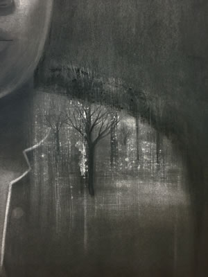
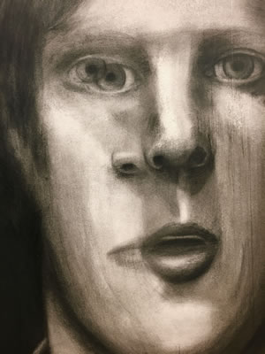
Chiaroscuro is a dreamscape that pulls us in and holds us there. A little light
penetrates giving us a clue, but still some anxiety remains as we scramble to piece the thing together. That ray of light is like a thought that travels slowly and unblinkingly and like a magic wand, reveals or conceals. In the portrait drawings of Fred Valentine, that ray is an eraser that extracts facts and feelings from a velvety dark ground and it’s wondering path illuminates psychically charged spaces.
Forms appear or might move left or right in a moment with random pentimento or full out original demarcation left in its wake and become charged as they call up an eye, a mouth or a gesture in his subjects. These drawings set things down but also hesitate, as if to run the audio needle over a record a little backward and forward, to pause and recall and to let things settle. As they find their groove, these powerful
drawings, hung here as if to recall a classical figure hall, memorialize the quiet existence of everyday people in a soft dust filled breath.
Fred Valentine on these works:
“The subjects in these drawings are real people that range from my daughter and other relatives to friends and people that I’ve worked with. There are also those with mild to severe forms of developmental and or psychiatric impairments. These people I knew while working as part of a clinical team at sheltered facilities and day treatment centers. I won’t tell you who is who as knowing that can often diminish a view of their strength and humanity. I want them to be anonymous. What you see is what you know. They all have their stories and history of course. Some sweet and tender others damaged and horrific. These are people that I’ve known and cared about to one degree or another. They were all made in the early 1990s. They sat with me and we talked. I first tried making a few quick sketches and jotting down some notes but soon realized that that made them uneasy and on guard. So with a very long cable release attached to my camera I would take a few random photos here and there as we were talking. I worked directly from the photos but I didn’t project them. With these particular drawings I began by taping the paper to the wall and then covering the entire surface with a few layers of charcoal. Then through a process of erasing and adding, scratching and scraping the figure slowly comes into existence. It is a kind of excavation. I get to know them very well. I looked in they looked out, creating the emotional intimacy that I wanted.”
For more information please contact info@schemaprojects.com, Mary Judge 718 578 3281.
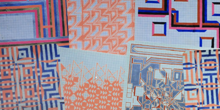
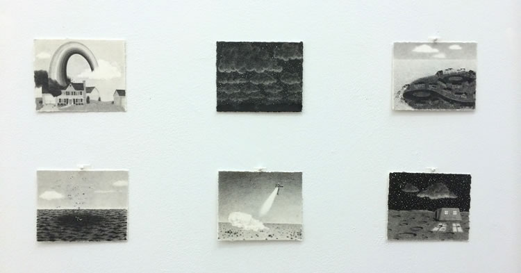
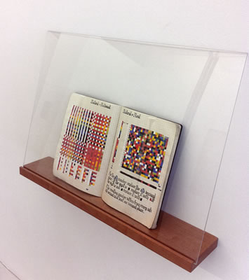
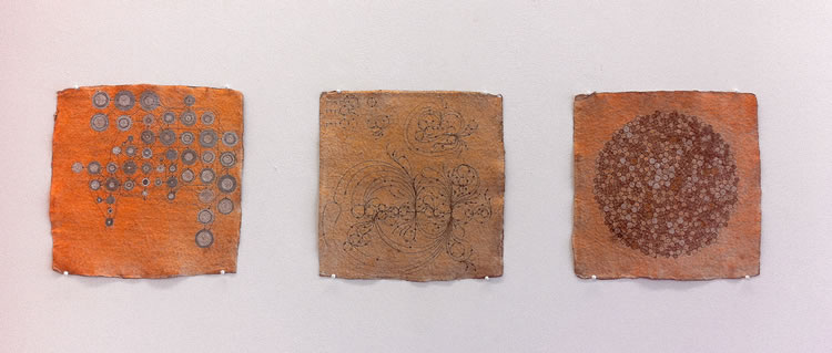
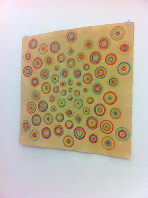
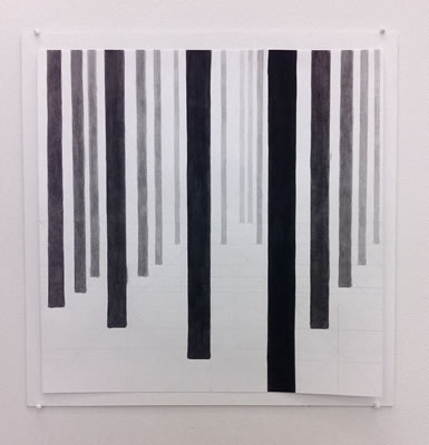
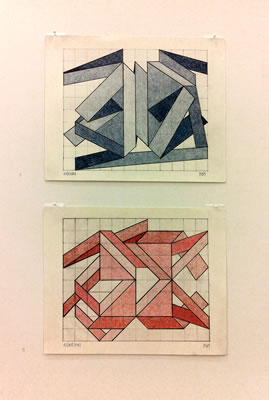
Andrew Zarou: Force Multiplier +
December 11 – January 17 , 2016
curated by Jeanne Heifetz
PRESS RELEASE:
Schema Projects is pleased to announce “Force Multiplier +,” a solo show of notebook drawings by Andrew Zarou, curated by Jeanne Heifetz.
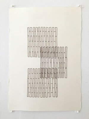
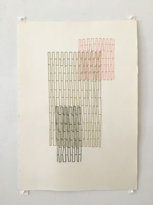
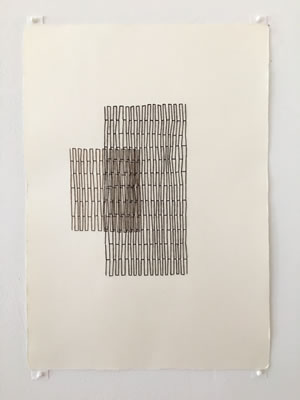
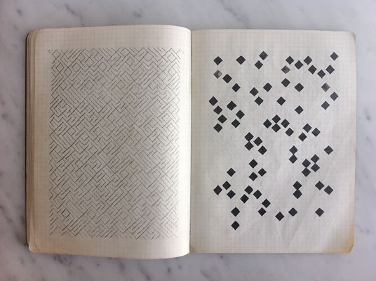
Andrew Zarou has long been known for his resourcefulness with materials. Two years ago, while recuperating from surgery, Zarou found himself on enforced bed rest – and profoundly bored. With no access to his usual media, he reached for the gridded notebook and gel pens he had bought months earlier -- almost on a dare -- precisely because they were so far from his preferred way of working. Initially these limited materials felt as confining as bed rest: nothing about the grid, or the palette, or the clear presence of the hand, or even the idea of working serially, fit into his current understanding of his work. (Some of the earliest notebook drawings, not shown here, reveal his intense frustration.) Zarou considered abandoning the methodical pattern-making the grid seemed to demand for something more immediate. But he had – quite literally -- nowhere else to go, so he persisted. And then, as often happens when artists pare down to a small set of variables, once he committed fully to these choices, Zarou emerged from what had felt like a narrow, claustrophobic passageway into an expansive realm of limitless possibility. No longer oppressive, the grid became open-ended and generative.
Indeed, what immediately strikes the viewer of the Force Multiplier series is its dazzling range. With the grid as his point of entry, Zarou sets himself a new challenge with each drawing, a new set of mathematical and visual rules to follow. Yet this underlying scaffolding is rarely visible in the completed drawing. The dominant characteristic of the series is surprise – for Zarou as much as for us. You can feel curiosity propelling him from drawing to drawing. A single algorithmic premise may suggest a half-dozen possible resolutions. Questions and experiments proliferate. The notebooks can barely contain their energy.
By the time Zarou recovered, the series had earned its place as a regular part of his practice. He titled it “Force Multiplier” in tribute to the completely unexpected power of the materials he’d nearly rejected. Zarou continues to carry the notebooks on his daily commutes, which would otherwise be lost time. Turning the NYC subways into his mobile studio, Zarou somehow manages to create a meditative zone of focus and concentration, enacting Saul Bellow’s definition of art as “the achievement of stillness in the midst of chaos.” But the drawings themselves are rarely still. Like other parts of Zarou’s practice, they evince what he describes as an “ongoing tug of war between chaotic uncertainty and the security of organization.” Anchored by the grid, metallic and fluorescent colors pulse and vibrate. As Zarou explores translational symmetry, repeated figures shift subtly, almost imperceptibly, from row to row. A second layer responds in counterpoint to the first. Multiple layers shift at different intervals; a musical complexity builds.
The Force Multiplier series reflects what Zarou calls “a balancing act between the physical manifestations of my core tendencies (repetition) and the spontaneous impulse for change (difference). Like the difference between climate and weather -- climate being the long-term trajectory of meteorological conditions, and weather the conditions of the immediate present -- repetition and difference live inside and move around each other in my work.” As though modeling his own internal weather in these drawings, Zarou is constantly testing the effects of the slightest shifts in initial conditions, with unpredictable and stunning results.
For more information contact: info@schemaprojects.com Jeanne Heifetz 718-757-8572.
Volume 2 : Black & White
co-curated by Mary Judge and Enrico Gomez
November 6 - December 6, 2015
PRESS RELEASE:
Volume 2 is one bookend of a two-part exhibition exploring the ways in which artists respond to paper and transform it from the 2 dimensional into the 3 dimensional in innovative and engaging ways.
On the highway of art, paper as an organic and primary material has a long and noble history. The word 'paper', derived from papyrus, was used by the ancient Egyptians, Greeks and Romans but is only one of the predecessors of paper, collectively known by the generic term 'tapa', indicating the inner bark of the mulberry and fig tree. Paper, as we know it today, traces its roots back to China circa AD 100. The craft of papermaking spread throughout the world and remained a relatively small-scale, artisan activity until its industrialization during the 19th century. In our show Volume 1, our artists expand on the manifold aspects of this ancient media adding a new chapter to its rich history.
Working with paper is primary for our artists who use it as a central part of their practice. It can be said that the use of paper today is often a rejection of the conventional hierarchy that privileges painting and sculpture over other visual media. To choose paper is a bold challenge to that convention, a political choice, which focuses our attention on a humble and often times discarded material and on the preconceptions we bring to ideas about the "value" of materials in art.
For our artists, paper is a serious play tool, a material like the mud puddle of our youth, where we can connect without overthinking. The reasons our artists use paper are as varied and personal as each individual: "it is portable", "it is intimate", "folding and tearing is meditative", "it is spontaneous and non precious", "it is alive, breathing, shrinking and expanding", "it can be transformed easily and quickly; it’s the blankest of slates". All hail noble fiber!
David Ambrose, Etamar Beglikter, Jerry Birchfield, Astrid Bowlby, Amélie de Beauffort, Lorrie Fredette, Liz Jaff, Christopher Michlig, Gelah Penn, Debra Ramsay, Lauren Seiden, Matthew Shelley, Barbara Siegel, Renee van der Stelt, Allan Wexler, Etty Yaniv.
Nina Bovasso: Flat, Baroque and Berserk
September 25 - November 1, 2015
PRESS RELEASE:
There no better feeling than standing in front of a work by Nina Bovasso. First there is the joy: it explodes across the page, spilling out of cracks and folds or creeping up from the rooted baseline or centerline of the page. She deploys an explosive fairy flower palette with the deftness and experience of a Celtic calligrapher. Nina Bovasso considers her works on paper a kind of anti-design or pattern gone amok. Working in varying sizes, notions of scale are present and vast, and as important as the initially obvious colorful palette. There is the whiff of menace that sneaks in and imagery that should not work but does, such as the piles of lemming-like Snoopies, the rapturous toxic bouquets, the menacing but captivating flames or the snake like rainbow bands that wrap the pulsing clusters, be they rows of little graphic shapes or stacks of tinsel like lines. Larger works feel like a Forth of July celebration, loosely tied together with swirling bands of color like dive bombers leaving colored jet streams in the wake of their barnstorming mission. Elements of sky and earth are un-hinged from the forces of gravity and tossed into space like a batch of pick up sticks suspended in a new arrangement. The vertical division created by juxtaposed paper engages us bodily and recalls it’s making. Within each drawing there is a curiosity built on a sophisticated mix of scales played out in a palette of pinks, reds, blacks and blues. Colors and shapes are happy to be themselves here in the hands of Nina Bovasso.
Threads of romanticism and obsession play out in Bovasso’s use of repeated pattern and opposing imagery. These elements call to mind the best of Fin de siècle design such as the graphic work of Josef Hoffman or the paintings of Gustav Klimt. Her works share affinities with the painting of Philip Guston and his use of pop-comic characters, his unsettled disorder and the compositional structure unique to Guston, of elements planted heavily on the foot of the page. She has taken the decorative and turned it on it’s head, taken beauty and laced it with “mal”. Bovasso in her way has captured our 20th century Fin de siècle and spins it into the new century: I wanna wake up to a Nina Bovasso every 21st century day.
“Flat, Baroque and Berserk” is a hats off to Roy Harper and his eponymous 1970 album used here to reference folk idealism and Bovasso's formal affinity to the multilayered texture of Harper’s acoustic guitar techniques. Schema Projects is pleased to present these exuberant works on paper.
Nine Bovasso attended The Cooper Union, SFAI (BFA) and Bard College (MFA). She has been the recipient of various grants including MacDowell Colony Fellowship, the Pollack-Krasner, Dieu Donné Papermill Residency, the Louis Comfort Tiffany Foundation Grant, New York Foundation for the Arts Fellowship in Drawing, The Marie Walsh Sharpe Art Studio program grant and a John Simon Guggenheim Grant in 2001.
Her work is represented in the collections of MOMA, Collectie KKPY Netherlands, The New Museum of Contemporary Art NY,The Whitney Museum of American Art, the Norton Family Collection, Museum of Fine Arts, Houston, Berkley Art Museum and Foundation Ricard Paris, France among others. She has shown extensively in the US and internationally, most recently at the M&E Gallery (Musuem Editions) NY NY, ADA Gallery, Richmond VA, Bravin Lee Programs, NY NY, Galeria Casado Santapau, Madrid Spain, Galerie Diana Stigler, Amsterdam NL, Galerie Schemla, Dusseldorf, DM to name only a few.
VOLUME 1
co-curated by Mary Judge and Enrico Gomez
May 15 - June 14, 2015

PRESS RELEASE:
Volume 1 is one bookend of a two-part exhibition exploring the ways in which artists respond to paper and transform it from the 2 dimensional into the 3 dimensional in innovative and engaging ways.
On the highway of art, paper as an organic and primary material has a long and noble history; the word ‘paper', derived from papyrus, was used by the ancient Egyptians, Greeks and Romans but is only one of the predecessors of paper, collectively known by the generic term ‘tapa', indicating the inner bark of the mulberry, fig and daphne tree. Paper, as we know it today, traces its roots back to China circa AD 100. The craft of papermaking spread throughout the world and remained a relatively small-scale, artisan activity until its industrialization during the 19th century. In our show Volume 1, our artists expand on the manifold aspects of this ancient media adding a chapter to its rich history.
Working with paper is primary for our artists who use it as a central part of their practice. It can be said that the use of paper today is often a rejection of the conventional hierarchy that priveleges painting and sculpture over other visual media. To choose paper is a bold challenge to that convention, a political choice, which focuses our attention on this humble and often times discarded material and on the preconceptions we bring to ideas about the “value” of materials in art.
For our artists, paper is a serious play tool, a material like the mud puddle of our youth, where we can connect without overthinking. The reasons our artists use paper are as varied and personal as each individual: “it is portable”, “it is intimate”, “folding and tearing is meditative”, “it is spontaneous and non precious”, “it is alive, breathing, shrinking and expanding”, “it can be transformed easily and quickly; it’s the blankest of slates”. All hale noble fiber
Volume 1 artists:
Nancy Baker, Richard Bottwin, Jaynie Crimmins, Mila Dau, Edoardo de Falchi, Ellen Hackl Fagan, Joan Grubin, Brent Hallard, Karen Margolis, Lael Marshall, Alex Paik, Gary Passanise, Sylvia Schwartz,
Lawrence Swan, Austin Thomas
Volume 1 (May 15 - June 14, 2015) will focus on works in color and Volume 2 (October 30 - November 29, 2015) will focus on works in black and white. Both shows are co-curated by gallery director Mary Judge and Enrico Gomez gallery director The Dorado Project.
eyewash@Schema Projects presents:
PAPER JAM: Exploring Visual Strategies for Social Concern
curated by Larry Walczak
April 3rd through May 3, 2015
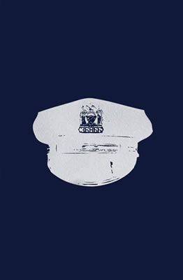
DAVID PIERCE
Militarization of Police #1
19" h x 12.5" ink and glitter on paper 2015
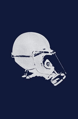
DAVID PIERCE
Militarization of Police #2
19" h x 12.5" w ink and glitter on paper 2015
PRESS RELEASE:
PAPER JAM is a celebration of paper and its use in visual art as well as a collection of socially conscious compositions. Participating artists were encouraged to focus on a current social/political issue that has affected them. The result is a diverse installation of both thought-provoking statements and well-crafted, beautiful artworks.
The artists were invited primarily on the basis of being well informed on current social topics. Additionally, this group represents a variety of different visual disciplines. Nearly all the work in PAPER JAM was created specifically for this exhibition. Artists entered into a dialogue with the curator to select and develop a topical subject appropriate for this show. This approach helped prevent overlap and ensured a coherent installation of the 13 artworks. PAPER JAM features everything from lush watercolors to compositions referencing street-art picture making. This collection of new art aims to re-think the notion that socially conscious art is inherently limited to angry one-note slogans and propaganda in general.
Artworks include Thomas Broadbent's large watercolor juxtaposing two handguns, one a revolver and the other a toy pistol. Meticulously rendered in lush color, both weapons become surprisingly seductive. Aubrey Rohmer completed a series of portraits of native children while on a residency in Guatemala. The portraits are painted in a startling red pigment to highlight the urgency of the CKDnT epidemic, which is currently decimating sugarcane communities. Michael Waugh creates a large mixed media piece utilizing text from a recent congressional report on torture. David Pierce offers viewers a comparison of two examples of police headgear: one the cloth hat with visor that completes a cop's uniform and the other a more contemporary helmet/hat associated with riot gear, showing the transformation of police officer into combat soldier. Pam Butler offers her take on climate change with an extended mixed media composition using street style graphics. Patricia Fabricant has created a series of “paper dolls for the new millennium,” a commentary on apparel and appearances. Jim Torok's cartoonish Jesus image is an obvious reference to the tragedy at Charlie Hebdo in Paris.
PAPER JAM attempts to create a visual dialogue regarding current domestic and global issues. If it raises consciousness in just one viewer I will consider this exhibition a success.
Artist including in the exhibition: Phil Beuhler, Thomas Broadbent, Pam Butler,
Jane Dickson, Elise Engler, Patricia Fabricant, Eve Andre Laramee, Ellie Murphy,
David Pierce, Aubrey Roemer, Jim Torok, Michael Waugh
eyewash is an independent migratory gallery founded by Larry Walczak in 1997 in a tenement building in Williamsburg, Bklyn. eyewash has organized exhibitions in Brooklyn, Manhattan, Newark, Philadelphia, Gent, Belgium and Berlin.
Peregrinations, Constellations
curated by Jeanne Heifetz
February 27-March 29th, 2015
PRESS RELEASE:
Emily Barletta, Janice Caswell, Clint Fulkerson, Colleen Ho,
Sarah Morejohn, Sharyn O'Mara, Paula Overbay, Jessica Rosner, Mia Rosenthal,
Karen Schiff, Drew Shiflett, Allyson Strafella and Robert Walden.
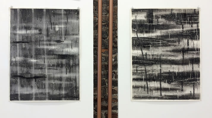
We live in the age of "big data." Through the reach of the internet, researchers in almost every field can now analyze thousands, even millions, of discrete bits of information, uncovering patterns and significance that smaller data sets could never reveal. Like "big data" researchers, the artists in our show make discoveries that are only possible through the aggregation of multiple small bits of information. Whether drawn or painted, stitched or torn, stamped or struck with a typewriter key, these works' patterns and imagery emerge from the process itself, a painstaking accumulation of tiny repeated marks.
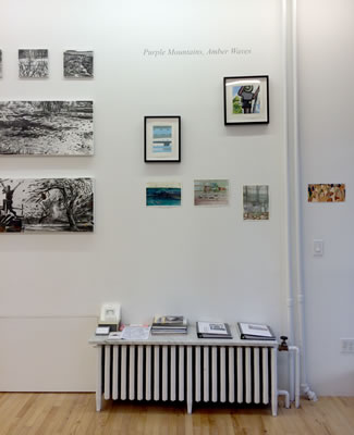
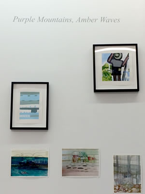
Purple Mountains, Amber Waves
February 27-March 29th, 2015
O beautiful for spacious skies,
For amber waves of grain,
For purple mountain majesties
Above the fruited plain!
With these words, from the patriotic song “America the Beautiful”, written as a poem in 1895, a vivid color experience is brought to bear and embedded in an idea about a people in a young country, a new Eden of seemingly endless bounty. As a youngster I loved these powerful lines and as a teacher I have used this image to explain the concept of atmospheric perspective in painting. It is a potent metaphor for a vast and fertile country that unfolded at the feet of these newcomers, representing their hopes and dreams. If one reads deeply into the song, it is also a sad ode to everything that is and was shortsighted about how we treat our lands now as then: how the land and it’s native peoples were disposed, it’s resources raked off and consumed, it’s wildlife decimated. Some however, held this untamed landscape in awe and saw to it’s preservation in the form of our National Park System and it’s explorers and artists did their part and still the pull is strong.
The “landscape” as subject in art has changed and so has our view of it: from bucolic, romantic, exotic to sublime, to vanishing, victimized, in peril and polluted by deeds of man and natural forces. Our greed and needs have heaped trauma onto our ancient home, sometimes altering it irrevocably. From a faithful depiction of the natural world, or as a means of conveying our inner emotional state, the theme of the landscape has been a dutiful receptacle for all things human, continually morphing over time. And as artists, no matter how we advance themes of abstraction, minimalism or conceptualism in our art, no matter how ironic or laced with the demands of political or personal expression our art forms become, as motif, it persists: our exhibiting artists find solace, subject and soul in nature.
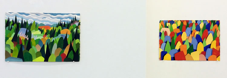
With “Purple Mountains, Amber Waves”, Schema Projects presents nine artists and their vision of the landscape today. Our artists: Gene Benson, Gregory Botts, Rowell Bowles, Scott Espeseth, Finn Have, Jane McNichol, Holly Overton, Jeanne Tremel, Josette Urso, Fred Valentine.
Gene Benson lives and works in the Catskills where mountainsides rise abruptly, each tree and rock looming above the next. In his work, Benson reduces observable imagery to simpler forms creating a luminous vocabulary that enables him to explore color worlds and patterns.
Gregory Botts is a painter who travels and paints on location through out the United States. His work is marked by a strong abstract component of flat and thick lines and patches as he reduces the landscape to the minimum of painted moves, sometimes including in the imagery, the presence of a traveler. Bott has shown most recently at Brian Morris Gallery in NY and a solo show at Alan Avery Art Company in Atlanta GA. He has been awarded artist in residencies at Death Valley National Park, Roaring Forks, Aspen, CO and Joshua Tree National Park to name a few. He was elected to the National Academy of Design in 1997. http://www.gregorybotts.com
Rowell Bowles was born in Chengdu, China, where he lived until his family returned to Canada during the missionary exodus of 1926. He began his studies at Victoria College, University of Toronto, and went on to attend Johns Hopkins University.
For more than fifty years Bowles was a spirited voice at the United Nations, holding various senior positions, including worldwide director of program policy for Unicef. He authored The Diplomacy of Hope, a critical history of the United Nations, and was a recipient of the Order of Canada.
A true Renaissance man, Bowles augmented a rich professional career with an artistic one. As a painter, he received encouragement from the leader of the mid-century Montreal avant-garde, Paul-Émile Borduas, as well as Group of Seven member Arthur Lismer. His work was been exhibited at dozens of galleries, including Gallery 78 (Fredericton), the Dorothy Cameron Gallery (Toronto), Galerie Agnés Lefort (Montreal), the Pleiades Gallery (New York), and the O.K. Harris (New York, 2006). Major collections with his work include the Montreal Museum of Fine Arts, the Carter Presidential Center and the Art Gallery of Windsor.
Rowell Bowles divided his time between Manhattan and Grand Manan. He passed away in 2012 at the age of 95.
Scott Espeseth: strange things happen in tiny places in the exquisitely crafted works of Scott Espeseth.
“The landscape, as I experience it most of the time in my home in the upper Midwest, would most accurately be described as “landscaping.” It is rarely wild, more often something planned and planted. For my drawings, I am especially interested in those plots where just enough attention has been paid that they may be safely ignored. The front yards of rental units, the no-man’s lands between divided highways, and office “parks” all are exercises in blank neutrality. Through drawing, I immerse myself in the banal details of these spaces, and find in their blankness a certain metaphysical plane, buzzing with ghosts and clairvoyant messages. There may be an intrusion of memory, warnings from a distant future, or a residue of unease that lies just below the surface. Always, the images are laden with a sense of failure, a pathetic disappointment reflected in their carefully placed yews and hostas.” Scott Espeseth lives and works in Madison Wisconsin. His works are included in the collections of the Pennsylvania Academy of the Fine Arts and the DePaul University Art Museum. http://scottespeseth.com
Jane McNichol, paints the landscape exclusively , working from still life to cityscapes, however her preferred motif is that of the open landscape. Jane travels outdoors and makes drawings that feature a strong contrast of black and white but her paintings are created by and large in the studio. Her dedication to the“vista”reveals a strong sense of abstraction while clearly rooted in a personal response to the feeling of a place. http://www.janemcnichol.com
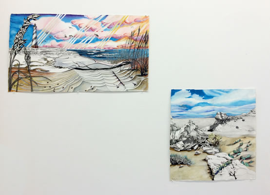
Holly Overton is a young artist living in Bushwick who is also a dedicated singer songwriter. Her watercolors often evoke the landscape of her childhood or travels with the suggestion of a hidden narrative. She delights in the use of montage imagery not unlike that found on postcards, or souvenirs, often with a sense of all American kitsch. There is a bit of surrealism that occasionally creeps into her work and her strong palette imparts an otherworldly quality. http://hollyoverton.com
Finn Have is a Danish painter who seeks to be in nature, to experience it and set it down on paper or canvas. He has painted from the landscape for many years with a brushy expressionistic hand, often laying down color over charcoal drawings. His drawings are rich, moody and spontaneous and he imparts the sense of energy of the natural forces he works from. http://www.finn-have.dk
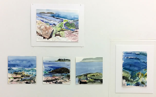
Jeanne Tremel has focused on studio work in abstract painting and sculpture for over 30 years, adding what she calls, “the hardest challenge, “ of watercolor plein-air seascapes of the rocky coast of Maine three summers ago. Similar in approach, her studio work and work outdoors are spontaneous and intuitive, but being immersed in nature, on the shoreline, along with the drama of fast-changing weather conditions add another element. She adds, “By being a part of the scene, I have to stay in the moment. Instead of talking to myself, I feel like I’m conversing with the water, rock and atmosphere. It’s quite exhilarating to capture a corner of all that the senses take in with simple color and marks on paper.” Jeanne received her MFA from The School of the Art Institute of Chicago in 1992 and has lived in Brooklyn for 20 years. http://jeannetremel.virb.com
Josette Urso’s Bushwick studio commands a view that looks out over the miles of neighborhoods that stretch towards Manhattan. Her work in abstract collage forms and her drawings from the land and sea scape inform each other to create a dense unruly grid-mix of lines, marks and colors. Urso’s approach involves “moment-to-moment” extrapolation governed by intuitive leaps of scale, mark and color to create a crazy quilt geometry. Whether she is working on the Amalfi Coast, out of her studio window, or in a messy interior space, she is always making images in direct response to her immediate environment. The paintings focus on the overall experience and summation of those locations, and are the heartbeat and the buzz of each particular place. http://www.josetteurso.com
Fred Valentine is an artist and owner of Valentine gallery in nearby Ridgewood, Queens. Valentine’s landscape work is mostly from and about memory. In the late 1970s and early 80s he and his wife lived on a former hippie commune on the Illinois Wisconsin border. The hippies had long since left and it was just the two of them and 350 acres of pond, field and forest. “At times it was so quiet after a rain one could hear the moisture being absorbed into the earth.” Valentine says. His pieces here, part of a series, are loosely based on looking down and across the land with a pinch of hallucination.
“A graduate of the Art Institute of Chicago, Valentine has roots in the 1970s Chicago Imagist scene that included Jim Nutt and Roger Brown those swaggeringly shameless picture painters who famously embraced human flaws and misadventure when the rest of the art world had turned toward a more austere Minimalist sensibility…..A master quoter, Valentine sometimes includes the illusion of a frame as part of the image. He isn't painting a Romantic landscape, he's painting an image of a Romantic landscape.” (Sharon Butler from her blog Two Coats of Paint)
Fred Valentine has a B.F.A. from the Columbus College of Art and Design and an M.F.A. from the School of the Art Institute of Chicago. His work has been reviewed and featured in the New York Times, Bomb Magazine, Time Out NY, and other publications. He received a grant from the Pollack Krasner Foundation and was awarded a residency at Yaddo. He currently teaches at Pace University in New York City and was recently included in Brooklyn Magazine's list of the 100 most influential people in Brooklyn culture. Fred is the recipient of a 2014 Guggenheim Foundation Award.
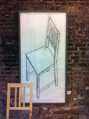
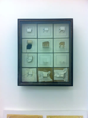
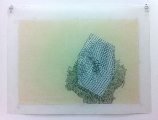
ALLAN WEXLER, Sight Lines: 35 years of drawing
May 9 - June 8 2014
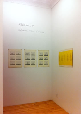
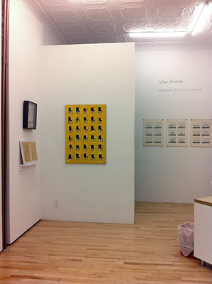
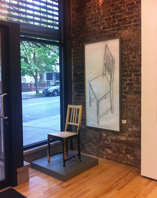
PRESS RELEASE:
My first encounter with Allan Wexler’s work was the occasion of one of his many solo shows at Ronald Feldman Gallery. The show was a tangible delight of rain catching structures, ephemeral and mind bending. There were wry conceptual riffs on functional objects and their enabling orthographic drawings, such as chairs, in various layouts, in 3D form or splayed open on the wall, deprived of functionality. There were works resembling objects, that in one’s mind should be solid and strong, but were not. Big things were made tiny, paper and fabric were made to perform herculean tasks. An intensity of energy was put towards the reconstruction of the humble brick, in paper as a series of miniature sculptures, each with it’s glass case, his version of “variations on a theme”. There was variety and insistence of seriousness in the “play” that kept one tickled on high notes that never seemed to let up, across the gallery space. The pièce de résistance was the recreation of a single 8 foot 2x4, made entirely of yellow tracing paper, leaning ever so nonchalantly, and self sustaining, against the gallery wall with it’s own wood storage crate.
Wexler delights us with “tiny”, he wows us with craft, he makes us construct function or form in our minds or follow a Rube Goldbergesque quest toward discovery. It would be a mistake to think of this work as merely cheeky, coy nor iconoclastic; Wexler creates the context for understanding his work, not just from what we know of the languages of drawings forms familiar to us but completely anew, and how often is it that we can say that?
Allan Wexler has worked in the fields of fine art, architecture and design for forty-five years, exploring human activity and the built environment. He works as an investigator using series, permutations and chance rather than searching for definitive solutions. He makes buildings, furniture, vessels and utensils as backdrops and props for ordinary human activity. His works isolate, elevate and monumentalize our daily rituals: dining, sleeping and bathing. In turn, these become mechanisms that activate ritual, ceremony and movement, turning these ordinary activities into theater. Allan Wexler is represented in New York by Ronald Feldman Gallery.
view press release
see video
read review
AFRANIO METELLI - Odyssey & Odes: Works on Paper
April 4 - May 4, 2014
PRESS RELEASE:
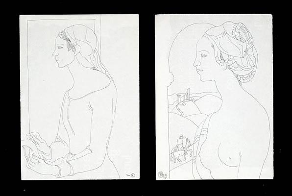
Schema Projects is pleased to present a selection of works on paper by the Italian artist Afranio Metelli (1924-2011). Selected from 5 decades of Metelli’s production, these works wander in and out of contemporary currents, picking up here and dropped there, their thread. Just as the work embraces and retreats with the outside world, so did this essentially Umbrian artist, who left his home region to travel to France, Mexico and the United States at moments of important artistic foment: to Rome, during the post Fascist years of the “Informal” movement, to France and Picasso’s ceramic studio at Vaullauris, to Mexico in the heyday of the great 20C muralists, to LA at the birth of Pop Art. He absorbed all these bright artistic movements into his own personal mix. Neither did he neglect the great local artisanal workshops having first studied after graduating from the Academia in Perugia, in Gualdo Tadino, a town know since the 14C for it’s superb ceramic works in lusterware . His early work here was an important influence throughout his life.
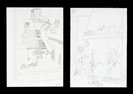
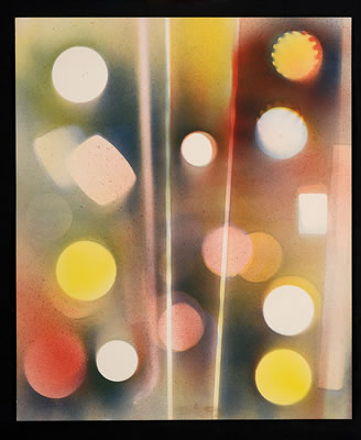
Metelli’s work often reflected his interest in styles and modes of other artists. He loved to experiment with different techniques as in his spray series, his odes to Klee or the torn paper/collage works that resemble Rotelli. At other times he turned to more classic heroes, such as Caravaggio, Velazquez and Antonello da Messina. He took up abstraction or discarded it at will. There was a surrealist thread that wove its way through his work that animated and gave mystery to his own brand of figuration. In another series, he celebrated iron tools, lovingly and realistically rendered symbols of a slowly dying lifestyle as Italian life shifted away from the agregrian to new modern modes of industry and technology.
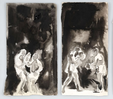
Afranio had a great love of boxing and did countless drawings of boxers in an array of states and poses. He was an avid collector of sewing machines, (probably an influence from his fathers shoemaking shop) and was a regular presence aside his wife Ann’s flea market table on the monthly antique circuit in Pissignano. Love and lore were continuously stitched together in his work, always authentic, his studio a rich and wonderful place to visit, each nook and cranny filled with various treats. One could never pigeon hole this artist: he remained a bit of an enigma and in this and so many other ways, he defied definition yet never managed to allude his fans, which included a host of local, national and international artists and visitors who gathered in this rich and beautiful area of the world.
While Afranio may not have been considered an important artist on the world art stage, he was one who felt deeply and directly, who created with an unblocked heart. His work left its mark on the territory of his birth and stands as a monument to a way of life that was profoundly tied to the earth and to the act of making.
Mary Judge
Owner Director, Schema Projects
Afranio Metelli (Campello sul Clitunno/PG/Italy 1924 – 2011)
Afranio Metelli was born in the family castle of Pissignano, Campello sul Clitunno, in the Umbria region Italy, in 1924. His father was a shoemaker and his mother worked at home and tended the olives. He graduated from the Fine Arts Academy in Perugia where he studied with the Futurist painter, Gerardo Dottori. but he yearned for more diverse experiences which he carried out in travels and his artwork, over the next 2 decades.
In 1951 Metelli moved to nearby Gualdo Tadino where he worked as a decorator in the well-known Santarelli ceramics plant. He remained there until 1952 when he moved to the Côte d’Azur, attracted as he was by the centre in Vallauris where Pablo Picasso had decided to settle and set up his own ceramics works. Here, Metelli was welcomed into the entourage of the artist from Malaga and while working in the ceramics factory run by the Calabrian Francesco Caleca, he participated in the Exposition des céramiques à Vallauris. His experience in Vallauris was particularly important as he felt it validated his work. It was here also that he found Picasso’s influence which was destined to leave indelible traces in his future works.
He returned to Italy in the late 50’s and experienced a difficult period in Rome, during the controversial “abstract –figurative” years, a period of isolation after Fascist rule. Metelli briefly attended the German Academy Villa Massimo in conjunction with another important Italian artist, Leoncillo. It should be noted that Metelli, did not experience the period of the “Informal” but instead choose to travel around the world in search of experience and inspiration. In 1957 he had a one-man show in Munich, followed in 1959-60 by participation in the VIII edition of the Rome Quadriennale. That summer, he taught at the Art Workshop run by Edna Lewis in Positano where he was Angelo Savelli’s assistant.
His style up until this point was figurative but also contained elements of abstraction which became more dominant beginning in 1960 when he began experimenting with various techniques, forms and materials, such as dripping, collage and décollage. The Luce nera series belongs to this phase, documented in 1962 by the exhibition at the gallery Numero run by Fiamma Vigo in Rome.
In 1962, he left Italy once again, this time for Mexico City, where he worked at the Museo Nacional de Antropologia. Here he had a show at the Galleria Souza, which allowed him to enter into the circle of Mexican artist active at that moment. He exhibited his work at the Souza gallery and was commissioned by the National Museum of Anthropology to reproduce images of the ancient Mayan civilisation. During his Mexican trip he managed to make several acquaintances among the young emerging artists whose inquisitive forays into seventeeth- and eighteenth-century Spanish art resonated with his own. Diego Rivera was still a looming presence during this time.
In 1964 Metelli moved to Los Angeles, CA, where he became a part of the group of young artists showing their work with Margo Levin. During an exhibition at the Orlando Gallery in Encino, Metelli’s painting was defined as ‘anachronistic’, confirming the artist’s great passion for the classics. This passion would remain with him and characterize the works presented in 1968 at the Numero gallery of a ‘pop’ matrix. In 1971, he returned to Italy, (living in LA had become too dangerous for his young family) and he dedicated the rest of his life to various projects. In 2008, the art curator and critic Giovanni Carandente organized a show in the Spoleto Contemporary Art Museum, comprehensive of the artist’s life work.
Essential bibliography
-Afranio Metelli. Opere 1935–1988, notes by B. Toscano e G. Falcidia, Arti Grafiche Nobili, Terni 1988.
-Afranio Metelli. Disegni, s.l., s.d. (ma 1990).
-Terra di Maestri. Artisti Umbri del Novecento 1960-1968, exhibition catalogue ed. by A. C. Ponti & F. Boco, Edimond, Città di Castello 2005.
-Senza Rete. Afranio Metelli, preface by G. Falcidia, Nuova Eliografica, Spoleto 2005.
Terra di Maestri. Artisti Umbri del Novecento 1969-1980, exhibition catalogue ed. by A. C. Ponti et al., Edimond, Città di Castello 2006.
-Afranio Metelli. Opere 1947-2008, exhibition catalogue ed. by G. Carandente, presentation G. Flamini, Emaki & Litostampa 3B, Spoleto 2008.
-Abbozzo Metelli Valentini. Artisti umbri del Secondo Novecento, exhibition catalogue ed. by A. C. Ponti & M. Duranti, Corciano, 4-31 August.
-Fabrizio Fabbri Editore, Perugia 2012.
R. Zucchini, http://www.zetau.it/notizie/2011/249-agosto-2011-nd-104-afranio-metelli.html
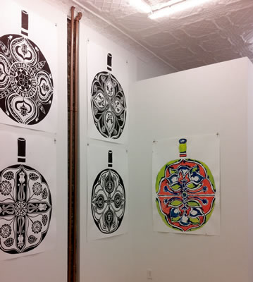
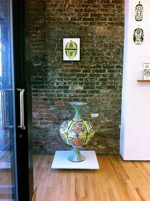
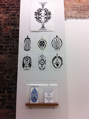
ELISABETH KLEY; Triple Masquerade: Ink Drawings, Vessels, Notebooks
February 28 - March 30, 2014
PRESS RELEASE:
The drawings of Elisabeth Kley seem to !ow as freely
as water in abundant abandon, morphing slightly
here and there, in their playful reverie. Her work
captures her own sense of ‘arcadia’ the touchstone
theme of great French artists of the past. Designed
to theatrically accessorize the domestic interiors of
a !amboyant world, her ceramic works are created
for the imagined homes of aging dandies that she
has been drawing for years, including Salvador
Dali, Erte, Coco Chanel, Elsie de Wolfe, Jack Smith,
and Ethyl Eichelberger.
Kley sometimes uses decorative faces on bottles
because she likes “when things look at you, as if
they are ready to come alive and change, like a drag
performer putting on makeup.” Many of her visual
references — garish Russian textiles, Renaissance
and Baroque grotesque ornamentation, and Islamic
art — are translated motifs as found in paintings
and set designs by such artists as Matisse, Van Dongen,
Dufy, and Natalia Goncharova. In her work, she
filters these fine art and decorative elements back
onto actual quasi-utilitarian objects.
Although Kley makes ceramic vessels, she does
not consider them craft. They are instead hybrids of
paintings and sculptures. Each bottle is unique, and
she executes numerous drawings and watercolors
before moving on to its decoration. In fact, a kind of
triple masquerade takes place. Decorative elements
move from the images that inspire them to works on
paper, and then back onto the emphatically useless
earthenware vessels.
Elisabeth Kley is a New York artist and writer whose solo exhibitions
of ceramics, watercolors, drawings, and prints have taken place in
the John Tevis Gallery in Paris, France (2012), Georgian National
Gallery in Tbilisi (2011), Le Petit Versailles (2010) and Rose Burlingham
(2009) in New York, and Momenta Art (2007) in Brooklyn. Her
work has been included in group exhibitions at Haunch of Venison,
Francis M. Naumann Fine Art, Lesley Heller Workspace, Exit Art and
Rupert Goldsworthy Gallery in New York; A. M. Richard Fine Art and
Storefront in Brooklyn; Gavlak Gallery in Palm Beach; and Season in
Seattle. She has been nominated for several grants and was awarded
a Pollock-Krasner Foundation grant in 1998. She is currently Chair of
the Board of Directors of Momenta Art.
OWEN SCHUH: Accumulations: Drawings & Notebooks
Schema Back Space:
Rachael Wren: Arboreal
January 24 - February 23, 2014

PRESS RELEASE:
Schema Project is pleased to present the first exhibition devoted to Owen Schuh’s works on paper.
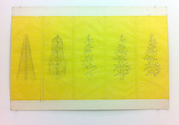
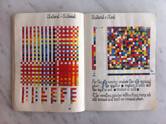
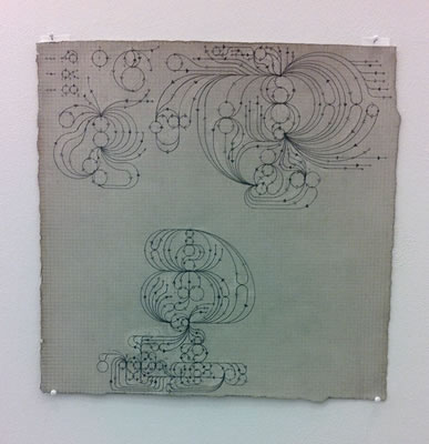
Schuh describes his dense and delicate works as “seeking to illuminate the entwining relations between embodied mind, mathematics, and the physical world.” Mapped out on sheets of stained or darkened paper, his delicate geometric figurations unfold across the surface and express his concentration as their glow emanates and draws us in.
Through research, he chooses mathematical functions that model the interactions and structure of living systems. Cellular automata, circle packing, fractals, and other topics in discrete mathematics form the basis of these systems. These “functions” bear the structure of life, but operate in the parallel world of the mind: a world of simulacra inhabited by numbers and abstract relationships.
The structure of the work is handcrafted using, at most, the aid of a pocket calculator. In each piece, he strives to manifest phenomena unique to the interaction between the physical medium and the logical structure. As Schuh describes, “the mathematical formula is a virus that depends on a host to carry out its peculiar kind of life until it terminates or the medium or the artist is exhausted.” In the end, the drawing is really only the physical trace of this activity—in this case, like a shimmering shell left behind on the beach.
Owen Schuh (born 1982, in Stevens Point, Wisconsin) lives and works in San Francisco. Initially pursuing biology, Schuh earned a degree in Fine Arts and Philosophy from Haverford College and an MFA from The Tyler School of Art, in Philadelphia, and Rome, Italy. He has exhibited nationally and internationally and lectures periodically on his work and algorithmic art practice. His work is included in the Kupferstichkabinett, Staatliche Museen zu Berlin. He recently completed a two year residency at the San Francisco artist collective Root Division, where he taught after school classes in origami to under-served public school students.
Rachael Wren - Arboreal
The work of Rachael Wren navigates the territory between the geometric and the organic. In this collection of work, not unlike the “Ideal Cities” of Renaissance artists, she creates an “Ideal Forest”. On a grid that maps out the forest floor, ribbon-like verticals sprout upward, suggesting a logical space. This “personal wood”, achieves a sense of air and space through the use of traditional atmospheric perspective.
However, the entire monochromatic environment seems vulnerable, as it might collapse at any moment, soft yet strong, in it’s combination of thin ruled line and pale grays. Using these sparest of means, Wren's drawings explore the universal duality between two and three-dimensional form, structure and randomness, and the known and the unknown.
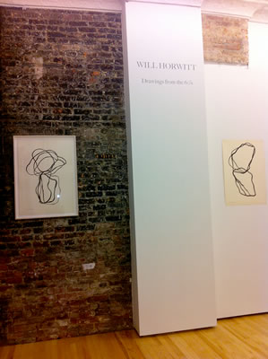
WILL HORWITT: Drawings from the 60's
December 13 - January 19, 2014
PRESS RELEASE:
Will Horwitt (b. 1934- d.1985)
Introduction:
"I first encountered the work of Will Horwitt in the home of a collector. The work in question was placed high on a wall and shared company with, among other things, a Judd print. It was a black ink line drawing executed with a brush, composed of overlapping rounded off square shapes, one set upon another, minimal and pure. This drawing, more than any other of the many works in the entire room, captured my attention. At that same time, I also came to discover his bronze and wood sculptures which were equally compelling. What happened to this voice, I wondered, why had I not heard of Horwitt?
"When I was able to see more of these drawings, my appreciation of the work grew. I discovered a zen-like concentration in the controlled but exploratory quality of the line in his drawings, which ranged from vulnerable ragged tangles, to monolithic textural masses incised or defined by thick ribbons of ink. Other drawings seemed to map out pathways over propositional forms, some suggesting folds, others rings of sculptural line. In some, one senses the figure, in others, a random displacement of rocks on a forest floor. The drawings on display in this show set a quiet mood and evoke a feeling of purity and piety, not that of the sublime, but that found in the everyday.
"Horwitt’s output related to many currents flowing around him at that time in New York City: which are mentioned below. It was clear from the start that this was work of merit; it needed to be seen. When I first contemplated opening and running a gallery from my building in Bushwick, the first show I wanted to do was Will’s. This, his mature and deeply felt work, had never risen fully to its proper place. I hope to right this fact in some small way with our exhibition of Will’s drawings from the 60’s."
Mary Judge,
Artist
Owner/Director Schema Projects
PRESS RELEASE:
Schema Projects is privileged to present, Will Horwitt, Drawings from the 60’s.
Will Horwitt wrote in his sketchbook in 1977- “to be, not to be seen”. Blending modernism and primitivism, his work yields nothing short of poetry.
Over the course of Will’s too-brief career, drawing played an integral part in his studio practice. His work in sculpture plaster to bronze casting, massive wood pieces, aluminum, stone and finally steel, is strongly reflected in the multitude of drawings he made during his lifetime. Though he worked in a simplified abstract mode reminiscent of Brancusi, Arp and the Asian influence of Noguchi, he continued to do self-portraits throughout his career.
The drawing mediums varied, sometimes india ink, wash and brush, others in pencil and pastel, a strong black on white component dominates although on occasion he integrated color. His late sculptures integrate with incised lines in wood, much of the feeling of his drawings. He said, “Sculpture isn’t about the object, it’s about the space around it.” He might also have added “inside it” as the last steel pieces mediate between interior and exterior space. His sculptural works are drawings in metal and wood.
Will Horwitt was born in New York City in 1934 and grew up in Stockbridge, MA. In 1965 he received the Guggenheim Fellowship for creative sculpture. Three years later he was awarded the Tiffany Purchase Grant. Will Horwitt was living and working in Tribeca when he died of lymphoma at Mount Sinai Hospital in New York City at the age of 51.
John Canaday wrote, “Mr. Horwitt is a most gratifying workman. The simplified, subtly warped forms in expressive balances are consistently mindful of Brancusi, but that is a good point of departure. Mr. Horwitt comes through as one of the strongest young sculptors around.” (NY Times, 1965)
His work is included in the collections of Yale University Art Gallery, Boston Museum of Fine Arts, Albright Knox Art Gallery, Herbert F. Johnson Museum of Cornell University, Hirshhorn Museum and Sculpture Garden the Smithsonian Museum, Washington DC, Indianapolis Museum of Art, Solomon R Guggenheim Museum NYC, the Wadworth Atheneum, Hartford CT, and the private collections of Nelson A Rockefeller, Vera and Albert List, Helen and Robert Benjamin among others.
Will Horwitt was represented in his lifetime by Lee Ault & Company and then Vanderwoude & Tananbaum Gallery.
BEASTS & BODIES
November 8 - December 8, 2013
PRESS RELEASE:
BEASTS:
The inspiration for our theme is the Medieval Bestiary, an illustrated book of known and fanciful animals and the plethora of fantastic ghouls that originate in ancient Japanese folklore, Yokai, the predecessors of Mothra, Godzilla and recently Guillermo del Toro’s Kaiju (Pacific Rim).
The Western tradition of the Medieval Bestiary delights us in its combination of beast and text, fantasy and reality: we imagine the monk in his cell, slowly modeling with love and attention his idea of a lion, a unicorn, or a giant fish in tempera and gold, together with it’s symbolic attributes. Medieval clergy used these texts about beasts to weave allegorical stories that instructed the lay public, in memorable ways, in the scripture and in desirable attributes. The first such text was the Physiologus (written in Greek in Alexandria in the second or third century CE, and a Christian invention) a "bestseller" that was translated into most of the major languages of Europe and western Asia and said to be the most widely-distributed book in Europe after the Bible. Our artist monk was part of a continuum that began with cave art and sought to capture with love, attention, with fear or regard, the animal world around us.
Now lets turn to the East and those badly behaving ghouls, goblins and phenomena, and those animal spirits that have invaded their human hosts, the Yōkai. Japanese folklorists and historians define Yōkai as "supernatural or unaccountable phenomena". The word yōkai is made up of the kanji for "bewitching; attractive; calamity" and "apparition; mystery; suspicious". Yōkai range eclectically from the malevolent to the mischievous, and occasionally bring good fortune to those who encounter them. Often they possess animal features (such as the Kappa, which is similar to a turtle, or the Tengu which has wings), other times they can appear mostly human; some look like inanimate objects and others have no discernible shape. Yōkai usually have a spiritual supernatural power, with shapeshifting being one of the most common (called obake). In the 18th Century, Japanese artist Toriyama Sekien attempted to depict each spirit of the ‘yōkai’ tradition; an ancient race of demons whose descendants would later terrorize the earth under the guises of Godzilla, Mothra and Rodan.
BODIES: “The Nude”
The inspiration for our theme is the model in the studio, as subject. What is it that draws us as artists, back to the nude? Not the naked per se, but the model, the artist’s muse, the artist’s employee, plunked down in front of us in the studio, performing small movements, the stop and go of it, favorite memories for many students of art. A tradition in Western art, the nude has been used to express ideals of male and female beauty and other human qualities and emotions such as pathos, for centuries, forming a subject genre of art, in the same way as landscapes and still life. The nude was a central preoccupation of the ancient Greeks, and after a semi-dormant period in the Middle Ages, returned to a central position in Western art with the Renaissance. Man, the measure of all things. And when we think of the Renaissance we often think of its great works of drawing, drawing of and about the nude, the human figure. Although the interest in the nude waxes and wanes throughout modern and contemporary art, artists continue to find inspiration in the human form and still today life drawing finds it’s place in every art school curriculum. Students continue to be drawn to the figure as subject not withstanding currents that move against it: what is it is that draws us back to the figure, the “nude”?
Sluice Art Fair, 47–49 Tanner Street, Bermondsey, London
October 2013
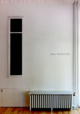
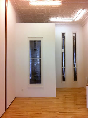
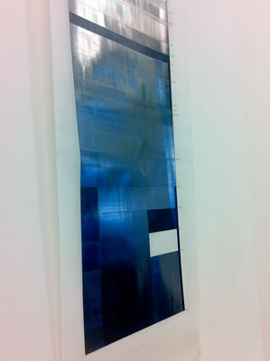
JOAN WALTEMATH
September 20 - October 27, 2013

PRESS RELEASE:
Schema Projects is pleased to present a selection of abstract graphite drawings on mylar by Joan
Waltemath, her first show in NY in 12 years. “The dinwoodies” refer to ancient rock drawings,
located in Wyoming where the drawings were executed over a 3 year period at the Jentel
residency in Sheridan in 2005 and 2008. In this particular case, the rock art works are notable for
their densely spaced linear elements and elegant, elongated proportions not unlike forms and
formats that prefigure in her work (“Torso/Roots” drawings). These works appear at first glance,
to be in line with Minimalism or the reductive works of Modernism; however, their true point of
origin, their relationship to the body and Waltemath’s interest in the haptic*, belies this
categorization.
In speaking about how her work is made, Waltemath says:
“What we can reach through the apprehension of the softness or the hardness, the pristine-ness
or the carefulness is also what sends us somewhere else, through our memories, on that journey
that art can take us on. By entering into the haptic world, possibilities open up that just don’t
occur with the images we perceive solely though our eyes.” ( from an interview with Mary Jones, BOMBLOG)
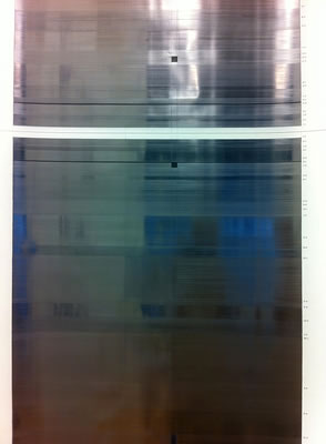
“The dinwoodies” are taut and sensual works made with colored pencil and graphite. Graphite, a
primary media of Waltemath, is laid down like an impasto, on vertical mylar sheets. An
underlying linear grid of squares, bands and rectangles, generated in a CAD drawing program,
and governed by harmonic proportions, serves as scaffold for a mapping of slots and shapes that
are filled, opened or layered with the material. This creates a highly reflective surface, filled with
variety. In our one on one experience with the work, the eye bounces off the slick metallic
surface but re-enters to grasp the image and content. The proportions hold us in tension and
create a sense of heightened awareness. Through the act of looking, the viewer experiences the
enfolding of surface and structure to discover meaning. The way of these masterful works, is
human and present.
BIO: Joan Waltemath grew up on the Great Plains. Her abstract paintings reflect the rich cultural
roots of the region with its vast open spaces. Using harmonic progressions she works in both
traditional and non-traditional media, reflective pigments in oils as well as a range of wet and dry
materials in drawing.
Shown in New York, Chicago, Portland, Los Angeles, London, Basel, and Cologne, her work is in
the collections of the Museum of Modern Art, the National Gallery of Art and the Harvard
University Art Museum among others. She has written extensively on art and served as editor-atlarge
of the Brooklyn Rail since 2001. She taught at the IS Chanin School of Architecture of the
Cooper Union from 1997 to 2010 and Princeton University since 2000. In 2011, she was
appointed the Director of MICA’s Hoffberger School of Painting. She was named a Creative
Capital grantee in 2012.
•haptic, from the Greek ἅπτικός (haptikos), means pertaining to the sense of
touch and comes from the Greek verb ἅπτεσθαι haptesthai, meaning to contact or to
touch.
FLAT FRONTAL
Curated by Schema Projects' assistant Marlene Frontera
July 19 - September 15, 2013
Lawrence Swan, Crux I, 2012 ink on paper, 11 x 10 3/4 inches
PRESS RELEASE:
For the first time, the public is invited to view a selection of works pulled from the archival flat-file of Schema Projects.
Flat Frontal presents a group of works that, face-to-face, appear flat, bare and exposed; yet up close, reveal the complex process and fixation of their makers.
Varied in appearance, from raw and personal handlings of geometric color-abstraction to the manual reproduction of an iconic manufactured garment print, these perfectly imperfect renderings are an intrinsic reference to their creators’ hands. The loving beat given to them is left behind as testament to their happy survival. Unafraid to show the hand’s human “mistakes”, the artists allow the crude line to realign the meaning of relic-making in their quixotic quest for the ‘ideal’. The results are physical incarnations of staggering visual preoccupations.
Included are works by Margrit Lewczuk, Meg Lipke, Traute Mathes, Afranio Metelli, Lawrence Swan, Robert Otto Epstein, Owen Schuh and the devotional paintings of the Shrinathji.
The Lost Syllabary: New Works on Paper by Vítor Mejuto
Schema Back Space:
Sue Havens: Recent Work
June 7 – July 7, 2013
PRESS RELEASE:
Schema Projects presents an exhibition of works on paper by Spanish painter Vitor Mejuto. Taking as motif, the "syllabary", a set of written characters for a language, in which each character represents a syllable, Mejuto's reductive forms are carved in graphite line and color. Each comes alive in context of the other, in forthright, no-nonsense ways. The paper space is engaged, forms materialize, flatten, and are treated with vivid color fill, all with a practiced eye for graphic design. In this way, Mejuto harnesses aspects of type forms and sound-images, both aspects of written and spoken language, to paper, line and paint.
The aesthetic ancestry of Mejuto’s work can be traced as a westward journey through geometric abstraction, from the Russian art movements of Constructivism and Suprematism through the European schools of Bauhaus and De Stijl, landing finally in the Minimalism of mid 20th-century. The strong geometric shapes of that tradition can be seen here, as he curves the bold graphics about each other, creating dynamic and confrontational mono-forms in color. More understated in color and contrast to the tempera paintings, are the graphite and colored pencil drawings which place tangles of interlocking vectors in muted shades against gridded backgrounds, further emphasizing the geometric play.
Born in Barcelona and educated at Facultad de Bellas Artes de Salamanca, Mejuto works and lives in Galicia, Spain. In addition to his artistic practice, he works as Chief Photographer for the newspaper La Voz de Galicia. This is his first solo exhibition in the the United States
of the book art community.
Schema Back Space:
Sue Havens: Recent Work
In Schema Backspace, Sue Havens will present large and small scale watercolors, drawings and 3 dimensional collages of painted paper.
The mediums of painting and sculpture inform each other in these paintings on paper as elements from each, are brought into the other’s context, producing novel and exciting results. Her two dimensional works involve the dense interlocking of abstract figures filled in with various gradients, often emulating the rippling surfaces of fabric or bark. The wall-mounted three-dimensional paper constructions layer similar planes of busy but muted textures and are given a vibrant tension by the use of careful spots of bright color.
Havens reinvigorates traditions of early abstraction as explored by Leger, DuBuffet, Art Brut and the constructed collaged of Dada and Cubist artists adding a homespun and "do it yourself" twist.
Havens attended Cooper Union and the MFA program at Bard College, and lives and works in Queens, New York. Having shown extensively in the New York area, her honors and awards include a New York Foundation for the Arts Fellowship in painting and selection for the Artist Registry at White Columns and The Drawing Center.
Rosaire Appel: Untranslated: Sequences, Solos and Books
Schema Backspace: Carmon Colangelo -
Glocal Yocals, Drawings, Sketches and Other Recent Musings
May 3 – May 26, 2013
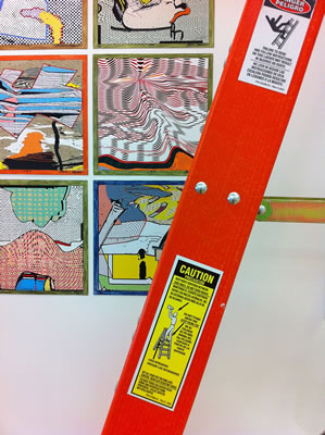
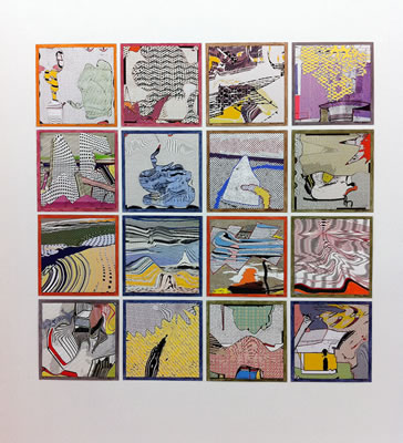
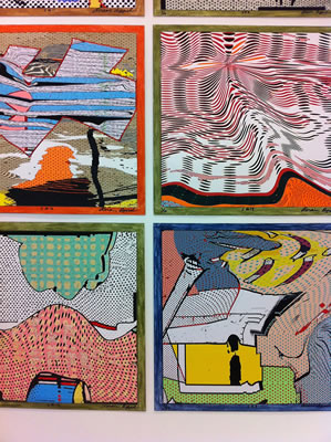
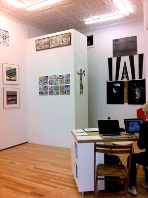
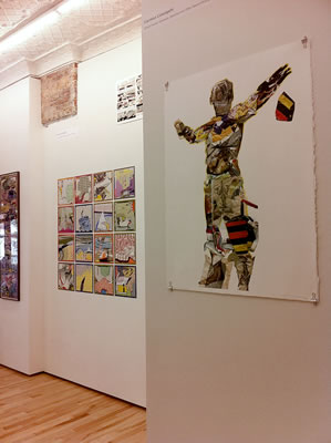
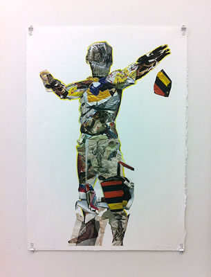
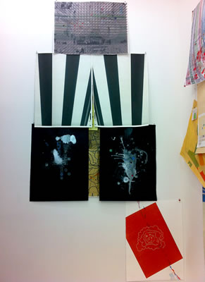
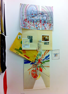
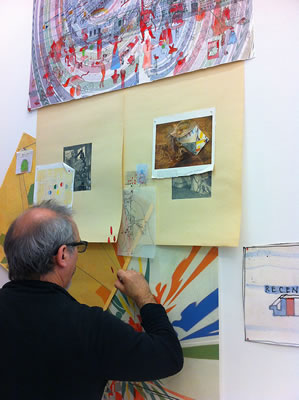
PRESS RELEASE:
Schema Projects is pleased to present an exhibition of works by author and artist Rosaire Appel. After painting for several years, Appel took up writing; she was intrigued by the idea of applying certain concepts of painting to fiction and also began to work with photography. Much of her work is an exploration of the territory that lies between word and image. Her most recent work uses the computer but the richness and complexity found here, sit solidly on a background in visual arts.
Included in Untranslated: Sequences, Solos and Books are her abstract comics, a new visual form, here presented in single cell, multiple cell or accordion fold format and limited edition books. Created solely by digital means, these prints have surprising richness and drama and contain a lacework of visual and linguistic references: a whiff of film noir, a dash of pop iconography, a glimpse down an alley in sharp winter sun, a warped reflection on the top of an oil slick, some fractured calligraphy; her work presents a wreathing morphology. Further enhancing these effects is Appel’s deft use of scale and varying paper finish (glossy vs matt) in the creative process. Out of digital means, not unlike a darkroom, these rich and disorienting collages emerge, and invest the youthful comic book art form with a new mature twist. This overview of her recent works will include chapbooks, handmade books, digital prints and singular stand alone works, all in print media on paper.
Born in New York City, Rosaire Appel grew up in a variety of small towns before returning to the city to study art and writing. Two of her novels were published in the nineties and her photographs and drawings have been exhibited locally. Embracing technology, Appel learned digital graphics through tutorials that were included with early graphic software. As a digital artist, she has exhibited widely online and in print publications, as well as participated in numerous gallery exhibits. Her work is well-recognized and respected in the international communities of abstract comics and asemic writing and she is a long-standing member of the art book community.
Schema Backspace:
Carmon Colangelo
Glocal Yocals, Drawings, Sketches and Other Recent Musings
Here we present Carmon Colangelo’s random collage installations and sketchbooks in stream of consciousness fashion. Carmon Colangelo’s recent work muses about cultural narratives, urban life, human ecologies, sustainability, globalism, social networking, transcendence, and recording everyday ideas. Using printed media, text, and juxtaposing the iconography from modernism with conceptual artmaking strategies, Colangelo’s sketchbooks and drawings record fleeting messages and digital flotsam composed of watercolor, prisma color, graphite, ink, digital media and collage and drawing assemblage. Glocal Yocals is a play on global and local communities mapped by images and ephemeral media as well as our changing notions about place and shifts between geographic location and local identity while contemplating a globalized future. Two new wall collage/drawing installations will be featured for the first time at Schema Projects.
Born in Toronto, Canada, Carmon Colangelo received his M.F.A. from Louisiana State University, Baton Rouge, Louisiana. His work has been exhibited widely in the United States as well as in Canada, Italy, Puerto Rico, Mexico and Korea. His works are in collections at the National Museum of American Art, the Whitney Museum of American Art, the Saint Louis Art Museum, and the Fogg Art Museum at Harvard University. He is the Dean of the Sam Fox School of Design & Visual Arts at Washington University in St. Louis and holds the E. Desmond Lee Professor for Collaboration in the Arts.
Brian Cypher: Survey, works on paper
Schema Back Space:
Shri Nathji Devotional Paintings: a selection
Selections from the Flatfiles
April 5 – April 28, 2013
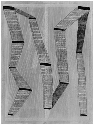
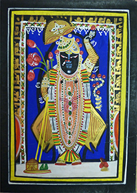
PRESS RELEASE:
Schema Projects presents the first survey of works on Schema Projects presents the first survey of works on paper by Brian Cypher. Cypher lives and works in Washington state. He first came on scene in New York in a show entitled “All Together Now” curated by Julie Torres during Bushwick Open Studios 2012. Since that time, Cypher’s reputation has quickly grown. Using paper as his primary medium, Cypher constructs a world of mental musings that result in slow thoughtful works. Out of ink, graphite, thin washes and collage he has constructed a fresh abstract language. Elements of repetitive marking and organic and geometric abstraction, come together in these quiet and contemplative works, that owe a depth to biomorphism and naïve art.
As an artist, Cypher is self taught. In high school, he first experimented with abstraction, working on the backside of pieces of mat board. He chose paper because it was an abundant and inexpensive resource. It was a logical transition from these first drawings on paper, to choosing drawing as an end in itself.
The show here brings together works completed over the past 15 years.
Schema Back Space:
Shri Nathji Devotional Paintings: a selection
In these devotional paintings, the Hindu god Krishna is depicted and worshiped as Shri Nathji. Colonel Tod, in his Annals and Antiquities of Rajasthan tells us that the great Vaishnavite saint, Vallabhacharya (ca. 1500 A.D.) was visited by Krishna in a dream. Krishna himself asked the sage to look for him on Mount Govardhana. As a result of his search, a stone image was found. Recognized as having great power, the statue was installed in the mountain temple. Nearly 200 years later, the ruler of Udaipur, in an effort to preserve it from Aurangzeb’s desecrations, had the stone image moved to his capital in Rajastan. On route, the chariot collapsed. Interpreted as the pleasure of the God to remain there, Nathji was removed from his cart and a temple was erected in this village called Siarh, now called Nathdwara.
These paintings have been made for centuries by a small group of artists working around the precincts of Nathji temple. These artists developed a thriving industry making small paintings and picchawais a large painted cloth that hangs behind the icon, as souvenirs for pilgrims. Featured at the center of these images is Shri Nathaji, a distinctive black stone figure with bright white painted eyes, usually dressed in seasonal clothing. This enigmatic black-faced figure of Krishna is worshiped to this day, in his mountain-lifting posture, a gesture of bringing the world into bloom, often signified pictorially by a blossoming tree.
Created according to a strict set of precepts, these paintings reveal how the act of devotion can imbue a formulaic image with infinite variety and inspirational purpose. A group of these paintings where featured recently in an exhibition at the Brooklyn Museum entitled: “ Vishnu: Hinduism's Blue-Skinned Savior”. These works were selected from a private collection developed over a 30 year period.
The scenery changes three times
Brian Belott, Matthew Craven, Sara Cwynar, and Jen Liu
Organized by Blonde Art Books
March 2 – March 31, 2013
PRESS RELEASE:
The scenery changes three times takes its title from a collage that Max Ernst published in his first graphic-novel and is a presentation that proposes a formal and conceptual connection between four participating artists and the chapbook – a pocket-size booklet first popularized in the sixteenth century as an apparatus for the dissemination of current events, poetry, and folklore.
Through collage, photomontage, and painting on paper, artists Brian Belott, Matthew Craven, Sara Cwynar, and Jen Liu create vivid environments brimming with fantastical imagery, abstract text, and an implied mythology. In addition, each artist produced an edition of up to ten chapbooks that reconstruct and reimagine the works they have displayed on the gallery walls. Points of investigation stem from the consistency of content and format, and the similar processes through which each artwork and chapbook is constructed.
Like the scenery on a stage, each artwork is a backdrop for a story to unfold. In line with its chapbook counterpart, the collage may be a setting for a lyrical ballad to be performed, or the conditions for a political inquiry. The scenery is embedded with a slew of possible narratives, each imposing its own permanence and historicity. Yet, the scenery is not fixed, rather it has the capability of transforming itself as well as all the elements within its reach. The scene changes: prolonging time, obscuring bodies and shapes, bending and twisting the vanishing point, and traveling freely from one state to the other.
With its second exhibition, Blonde Art Books continues to examine the curatorial methods through which traditionally displayed works of art presented alongside artist books may further enrich the experience and understanding of an art exhibition.
For more information please email Sonel Breslav at blondeartbooks@gmail.com.
Brian Belott was born in East Orange, NJ. He lives and works in New York and received his BFA 1995 from School of Visual Arts, NY after a stint at Cooper Union. Belott works in a variety of mediums including collage, sculpture, installation, video, sound, and performance, often including found objects. Belott has mounted several major solo exhibitions including Zurcher Studio, New York; CANADA, New York; Galerie Zurcher, Paris; and Kenny Schacter Contemporary, New York. Most recently his work was included in exhibitions at Anna Kustera, New York; Royal/t, Culver City, California; The Hole, New York; The Journal, New York; Loyal, Malmo, Sweden; MACRO Museum, Rome; Museum of Modern Art, New York. Belott’s first book, Wipe That Clock Off Your Face was published by PictureBox, in 2007. http:// www.brianbelott.com/
Brian Belott is represented by Zürcher, Paris/New York.
Matthew Craven uses historical images as a backdrop for a more abstract form of storytelling. Images from lost cultures, relics and landscapes, both well-known and extremely ambiguous create the patterns within my work. These arrangements highlight shape and composition rather than historical accuracy, solidifying their participation in a completely unique myth. Born in Grand Rapids MI, Craven lives and works in New York. He received his BFA from Michigan State University in 2004 and his MFA from The School of Visual Art in 2010. He has participated in exhibitions at Marvelli Gallery, New York; Allegra LaViola, New York; The Hole, New York; Jen Beckman, New York; Perry Rubenstein, New York; Gallery Hijinks, San Fransisco; Nudashank Baltimore, and Grizzly Grizzly, Philadelphia. http://matthewcraven.com/ home.html
Sara Cwynar’s work explores the materials of the art studio and the idea that everything present can be used. For No Hierarchy, Cwynar began to bring together scraps and studio detritus on the floor into a shape that evolved over weeks of living with it. The piece mixes images and references freely - making connections as they appear through the arrangement of materials. An avocado seed positions itself as a sun
setting over a flat picture of a mountain from a photography manual; a real plant sits on a picture of a plant; everyday objects, garbage, obsolete stock photos and personal photos mix, and copies of older artworks appear again in miniature. Born in Vancouver, Cwynar is a New York-based artist. Her work has been exhibited at Ed Varie, New York; The New York Art Book Fair at PS1 MoMA; and Printed Matter, New York. Cwynar’s forthcoming solo exhibitions include The Foam Photography Museum, Amsterdam, and Cooper Cole Gallery, Toronto. The publication of her second book ‘The Kitsch Encyclopedia’ is scheduled for Summer 2013. Public collections include the Soho House Toronto Collection. www.saracwynar.com/ index.html
Jen Liu was born in Smithtown, New York, and currently lives and works in Brooklyn. In her individual and collaborative practices she explores the overlapping of formal structures and history, often using fictional constructs to consolidate a variety of seemingly disparate, but fundamentally related issues. Liu received a BA from Oberlin College and an MFA from California Institute of the Arts. She has exhibited internationally, with past exhibitions at Kunsthalle Wien; Upstream Gallery, Amsterdam; On Stellar Rays, New York; Aspen Art Museum, Colorado; Kunsthaus Zurich; Ceri Hand Gallery, London; Royal Academy, London; Henry Art Gallery, Seattle; Czarna Gallery, Warsaw; and De Hallen Museum, Netherlands. Her work is in public and private collections, including the Goetz Collection, Zabludowicz Collection, Museo de Arte Contemporáneo de Castilla y León in Spain, and UBS Bank and BEKB Bank.
Established by Sonel Breslav in 2012, Blonde Art Books is an organization dedicated to promoting exceptional publications about and by international artists. The bookstore, currently located in Schema Projects, a new gallery in Bushwick, New York, features independent art publications by contemporary artists and small presses. The blog collects and disseminates information about independent publishers, exhibitions, and publishing resources in the fields of art, poetry, criticism, and cultural studies. In addition, Blonde Art Books curates book-centric exhibitions that examine the connections between traditionally exhibited artwork and the books, magazines, and other printed matter that inform and shape their conception. www.blondeartbooks.com
DRAFTED
January 25 – February 24, 2013
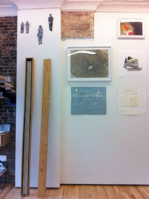
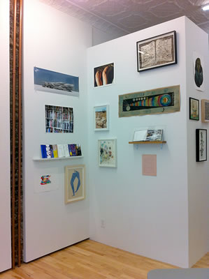
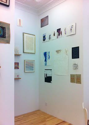
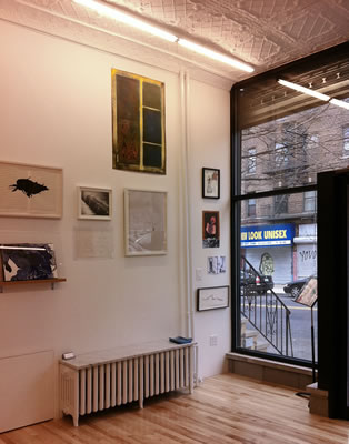
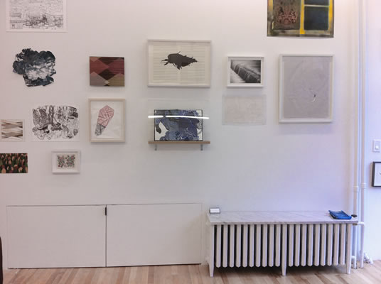
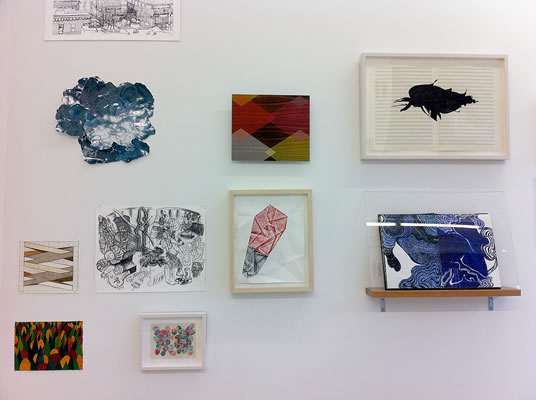
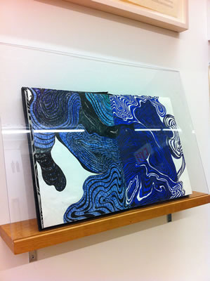
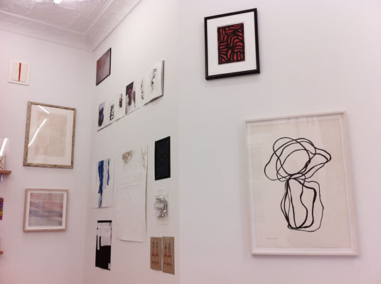
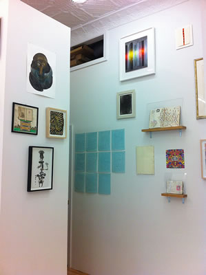
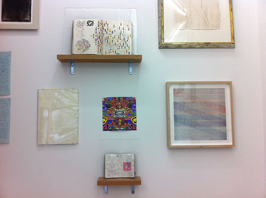
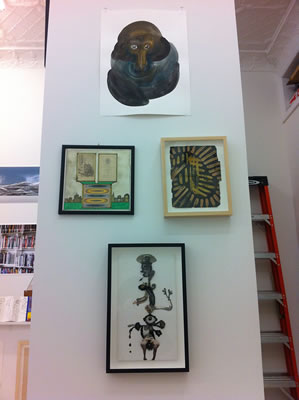
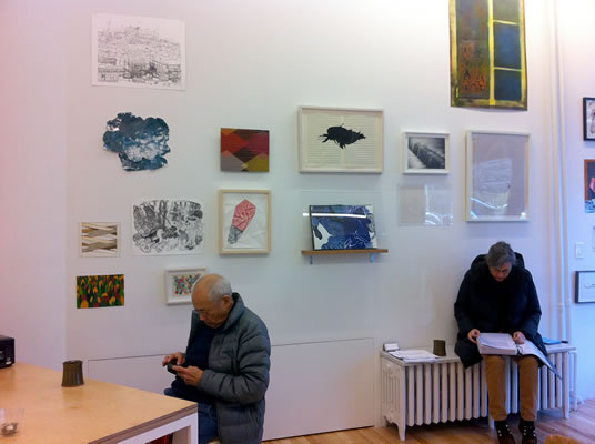
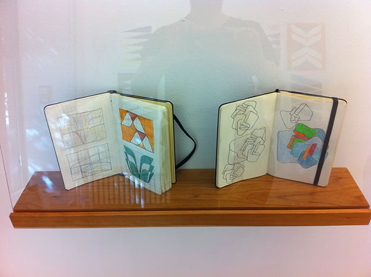
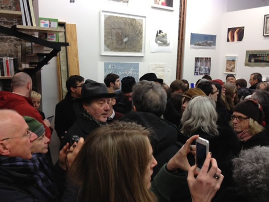
PRESS RELEASE:
Drafted is the inaugural show of Schema Projects, the first Bushwick gallery
dedicated exclusively to works of art on paper. Housed in a former barbershop
storefront, it is the brainchild of New York artist Mary Judge, well known for her
dedication to all forms of drawing, both as a studio artist and educator. Schema
Projects will feature exhibitions of drawings, prints, sketchbooks, artists books,
illustration and all things made on or of paper. The aim of the gallery is to highlight
art forms on paper and to give exposure to the role of drawing in the creative
process of all fields. This inaugural show will include local, national and international
artists, with artwork arriving from Russia, Belgium, Spain, Denmark and Italy.
It is our hope that Schema will contribute to the cultural dialogue in the visual arts in
this vital community. Schema will have Director and Curator organized exhibitions
throughout the year. A flatfile will extend the gallery holdings and be open to the
viewing public.
US Artists: Keren Benbenski, Gene Benson, Elena Berriolo, Joe Biel, Frederick Biehle, Bunny Burson, Brian Cypher, Mila Dau,
Steve DeGroodt, Katarina Denzinger, Joseph Dumbacher John Dumbacher, Robert Egert, Veronique d'Entremont, John Evans, India Evans, James Gill, Kathy Goodell, Ken Gray, Julie Gross, Mara Held,
Hanna Herr, Will Horwit, Sherri Hollander, Alfred Jensen, Mary Judge, Joan Kahn,
Susan Kammerer, Gaston Lachaise, Sol Lewitt, Meg Lipke, Nancy Manter, Traute Mathes, Karen Margolis, Angela
McGuire, Thomas Micchelli, Gerard Mossé, Chiura Obata, Morgan O’Hara, Carolie Parker, Philip Parker, Carol
Peligian, Polly Saputo, David Scher, Anne Seidman, Hilda Shen, Buzz Spector, Lawrence Swan, Kate Teale,
Austin Thomas, Rob de Oude, Josette Urso, Joan Waltemath, Allan Wexler.
International Artists: Dmitry Babenko (Russia), Amélie de Beauffort (Belgium),
Sveva Belluci (Italy), Antonio Freiles (Italy), Simona Frillici (Italy), Finn Have
(Denmark), Elisa Macellari (Italy), Vitor Mejuto (Spain), Afranio Metelli (Italy).
92 St Nicholas Ave between Hart and Suydam Brooklyn NY 11237 info@schemaprojects.com © 2016 Schema Projects